Product packaging design that earns the second look.
Physical design that creates moments. We design packaging, labels and print that feel premium in the hand and hold together all the way to press — from the first concept to the file your converter runs without a single email back.









Trusted by teams at Amazon, Accenture, Novo Nordisk, Intuit, Twilio, Ola, PhonePe and Air India Express.
Packaging is the only part of your brand a customer holds.
Everything else is glass and pixels. Packaging has weight, texture, a spine that has to survive a warehouse, and about three seconds on a shelf or a scroll before someone decides. That physical reality changes how design has to be made — not prettier, but truer to the product inside and stricter about what happens at the press.
DesignHQ’s packaging design services cover the whole span: the identity work that makes a box recognisably yours, the label that carries mandatory information without looking like a compliance document, the collateral that keeps your brand consistent across every printed touchpoint, and the production-ready artwork that gets all of it made correctly.
We work as a subscription, not a project. Plans start at $1,500/month with 24-hour turnaround on individual assets, which means a packaging system, a label variant for a new SKU, and next quarter’s brochure all come from the same team at a fixed monthly rate — no new scope, no new statement of work.
What This Covers
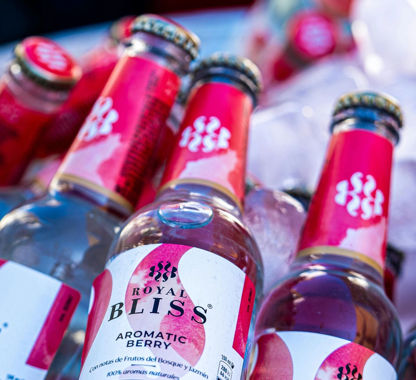
Brand Identity on Packaging
We design packaging that instantly communicates your brand's personality and values, creating a cohesive visual language that stands out in any retail environment.
Brand Identity on Packaging
We design packaging that instantly communicates your brand's personality and values, creating a cohesive visual language that stands out in any retail environment.
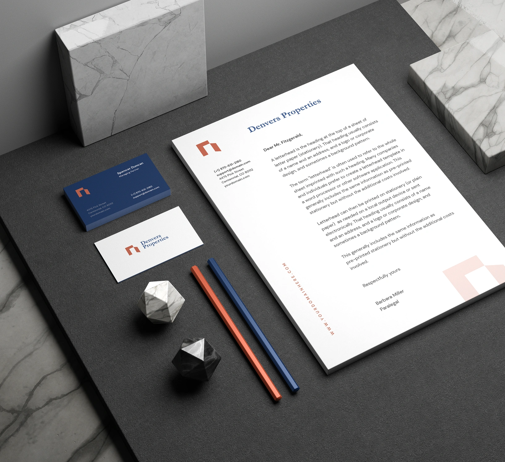
Print Collateral
We deliver crisp, professional print materials from business cards to brochures that reinforce your brand identity, ensuring every touchpoint leaves a memorable impression.
Print Collateral
We deliver crisp, professional print materials from business cards to brochures that reinforce your brand identity, ensuring every touchpoint leaves a memorable impression.
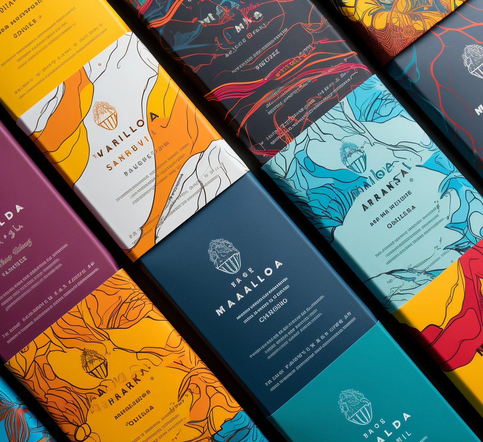
Production-Ready Files
We prepare print-ready artwork with precise specifications, color profiles, and dielines, working seamlessly with manufacturers to ensure your vision turns into reality.
Production-Ready Files
We prepare print-ready artwork with precise specifications, color profiles, and dielines, working seamlessly with manufacturers to ensure your vision turns into reality.
Brand packaging design starts with the brand, not the box.
Most packaging goes wrong at the beginning, when someone opens a dieline template and starts decorating it. We start a level up: what does this brand look like when it becomes an object?
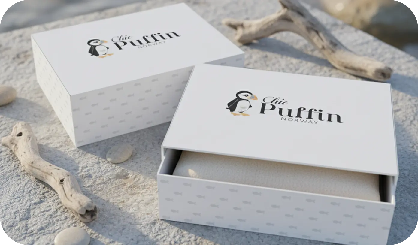
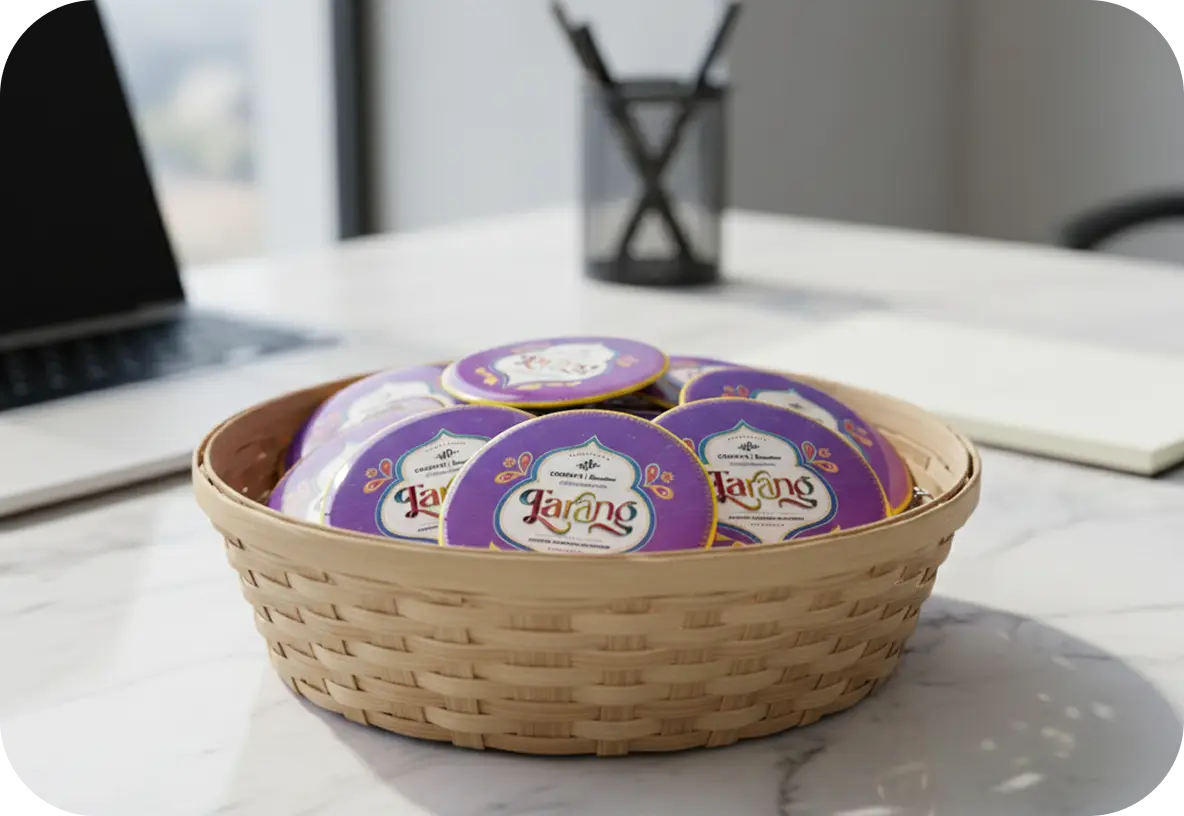
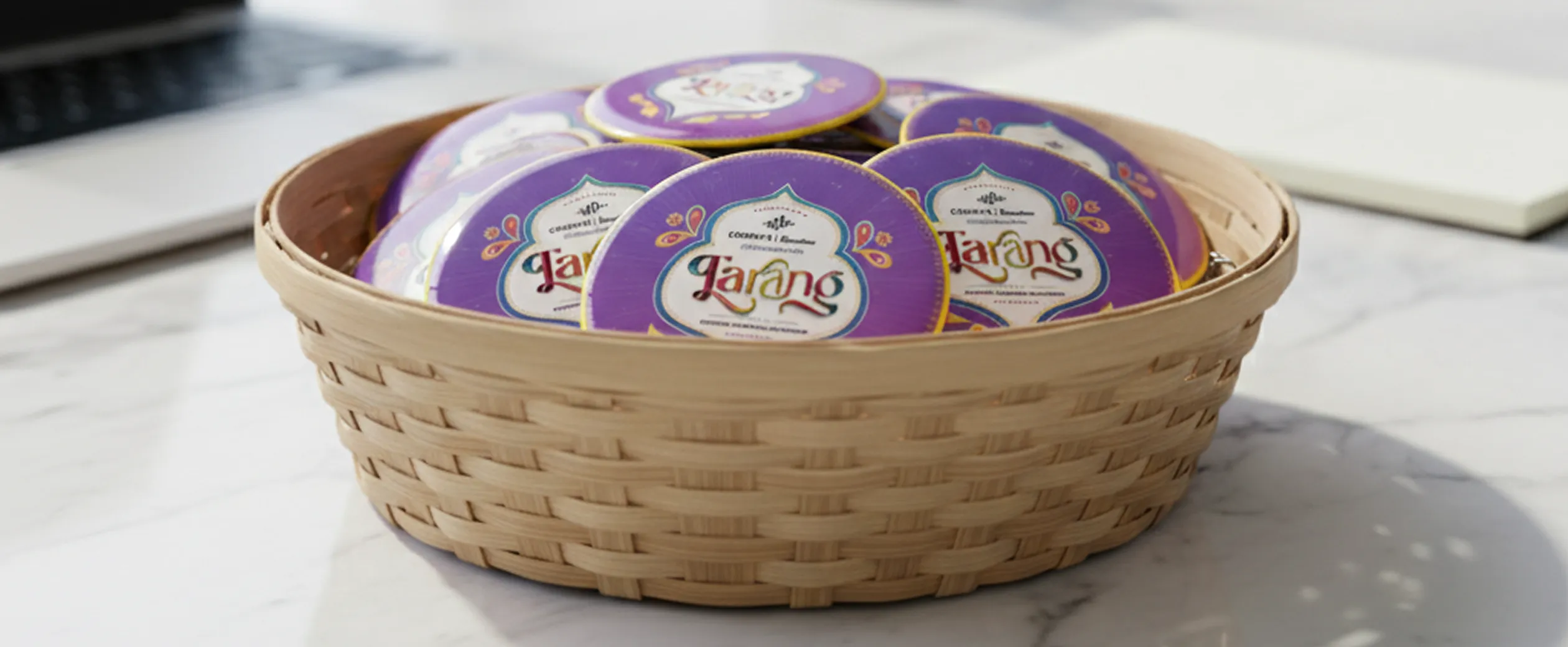
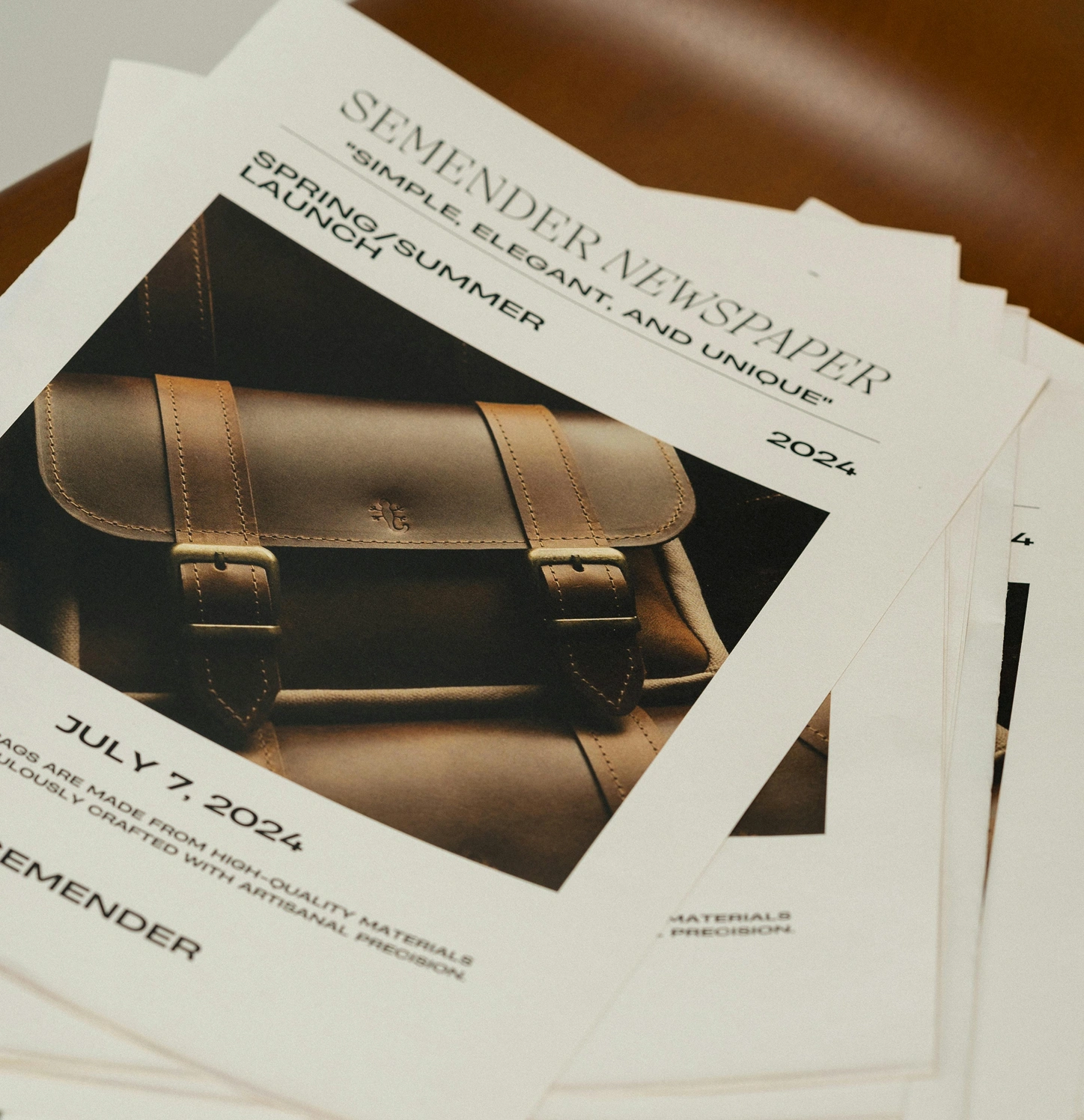
That means the identity comes first — the logotype, the palette, the type hierarchy, the pattern or illustration system that will need to stretch across a tin, a pouch, a shipper and a shelf-edge card without losing itself. Chic Puffin Norway runs on a logo and pattern system applied across a family of boxes. Tarang carries an illustrated mark across branded tins. In both cases the packaging design is downstream of a system, which is why it holds up across formats.
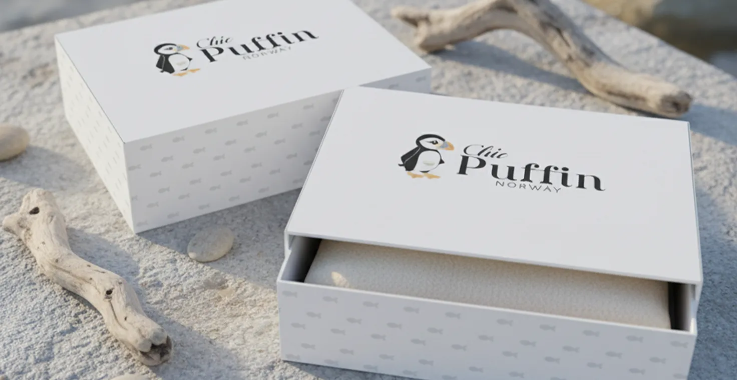 Chic Puffin Norway
Visual hierarchy and shelf logic
A pack has to answer three questions in order, at distance: what brand is this, what is it, and why this one. That ordering decides the layout — not aesthetics. We build the hierarchy for the actual viewing context, whether that’s an arm’s length on a retail shelf, a 400-pixel thumbnail on a marketplace listing, or a hand holding the product at the counter.
Structure, format and material
Packaging design has to respect what the pack physically is. A folding carton, a stand-up pouch, a rigid gift box and a printed tin each behave differently — panel proportions, fold lines, how ink sits on the substrate, what happens to your palette on kraft board versus coated stock. We design to the format rather than adapting a flat layout onto it afterwards.
Product packaging design across the formats you actually sell in.
Growing product lines rarely need one pack. They need a system that can absorb a new flavour, a new size, a gift edition and a marketplace variant without a redesign every time.
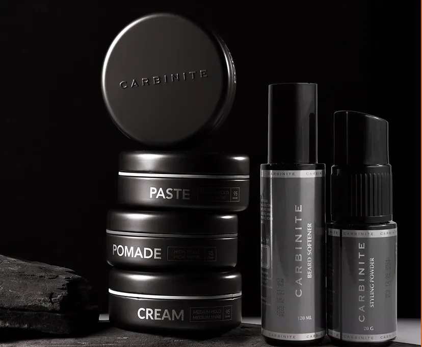
Boxes, cartons and containers
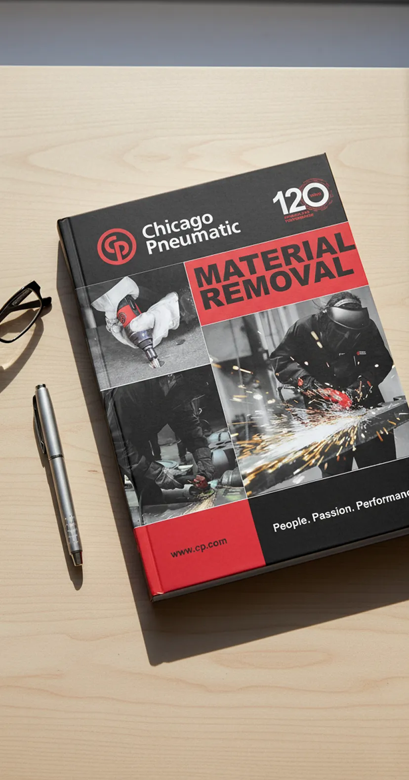
Primary and secondary packaging — folding cartons, sleeves, rigid boxes, tins, jars and bottles. We design the panel architecture so that front-of-pack recognition, side-panel information and back-of-pack detail each get the right amount of room, and so the family reads as a family when three SKUs sit side by side.
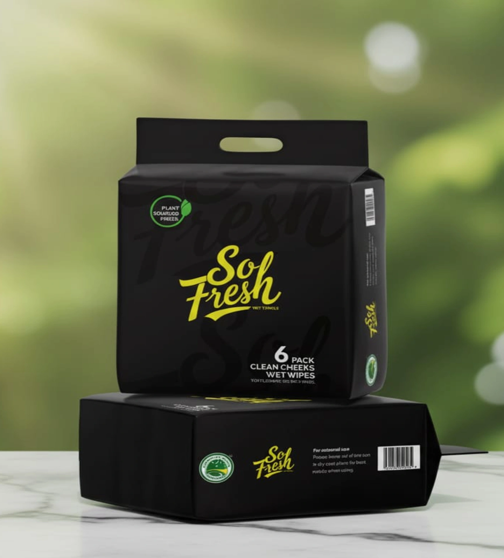
Pouches and flexible packaging
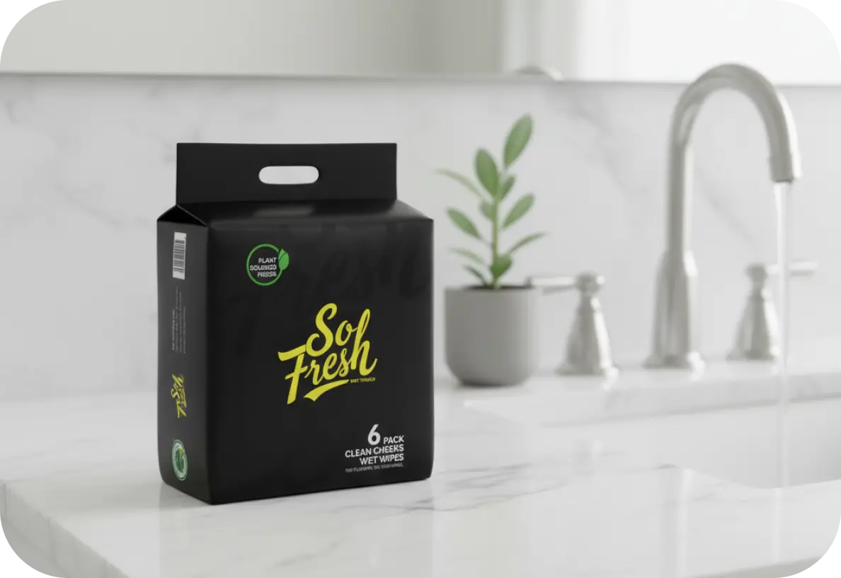
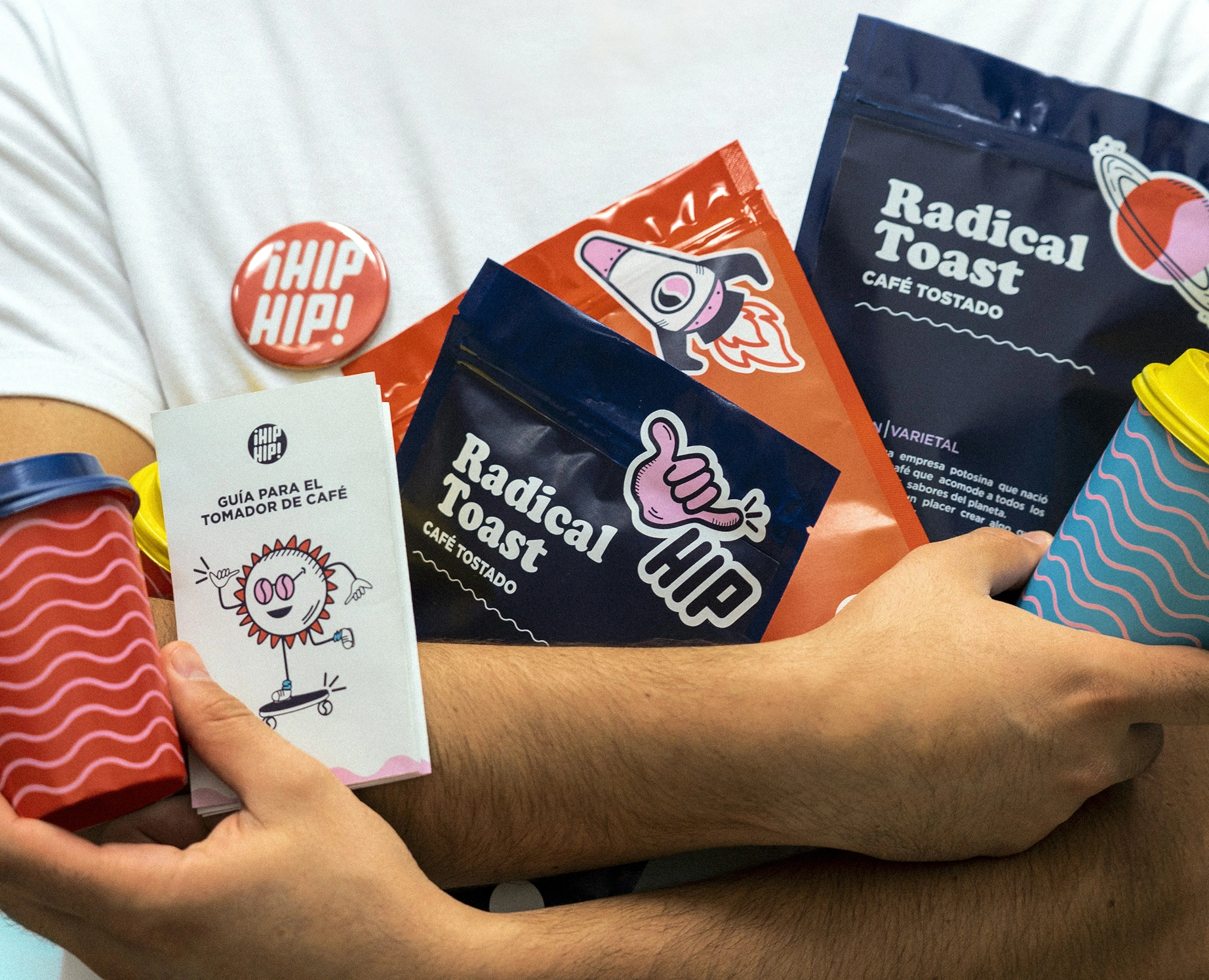
Flexible formats compress everything into a curved, creasing surface. Our So Fresh work is a branded wet-wipes pouch; the same discipline applies to food, supplement and personal-care flexibles, where safe zones and seal areas eat into the layout before design begins.
Gift, launch and unboxing moments
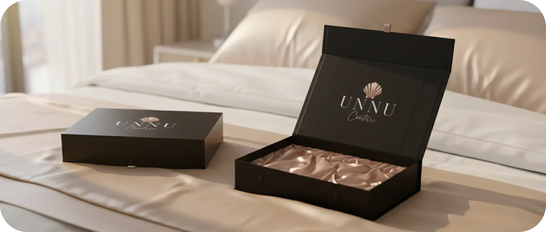
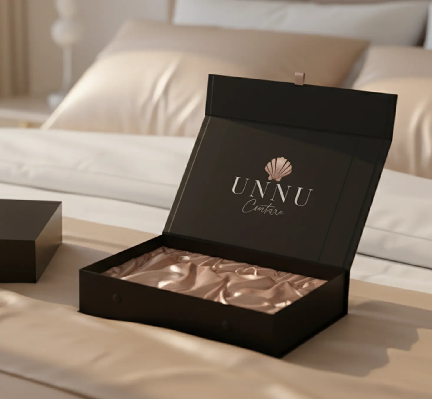
Some packaging has a job beyond protection. UNNU Couture’s branded gift boxes are built for the moment of opening — the reveal sequence, the inside surface, what the customer sees when the lid comes off. Unboxing design is a deliberate choice about sequence, not a finish applied at the end.
Packaging design from India, for brands anywhere
We design from Bangalore and deliver worldwide. Our packaging design and print work goes out to brands across India and to international teams — Chic Puffin Norway is a live example — and files are prepared to whatever specification the receiving printer or converter works to, in metric or imperial, CMYK or Pantone.
Label design that reads clearly and still looks like you.
A label carries more mandatory content than any other brand surface, and it has the least room to carry it. Ingredients, net quantity, batch and date coding, barcodes, warnings, claims, importer details — all of it fighting the same square inches as your logo.
Good product label design solves that as a hierarchy problem. Primary brand recognition holds the top zone. Product descriptor and variant sit where a shopper’s eye lands second. Regulatory content gets a clean, legible, deliberately quiet system — set at readable sizes, in proper reading order, with barcodes placed on a flat area that a scanner can actually read.
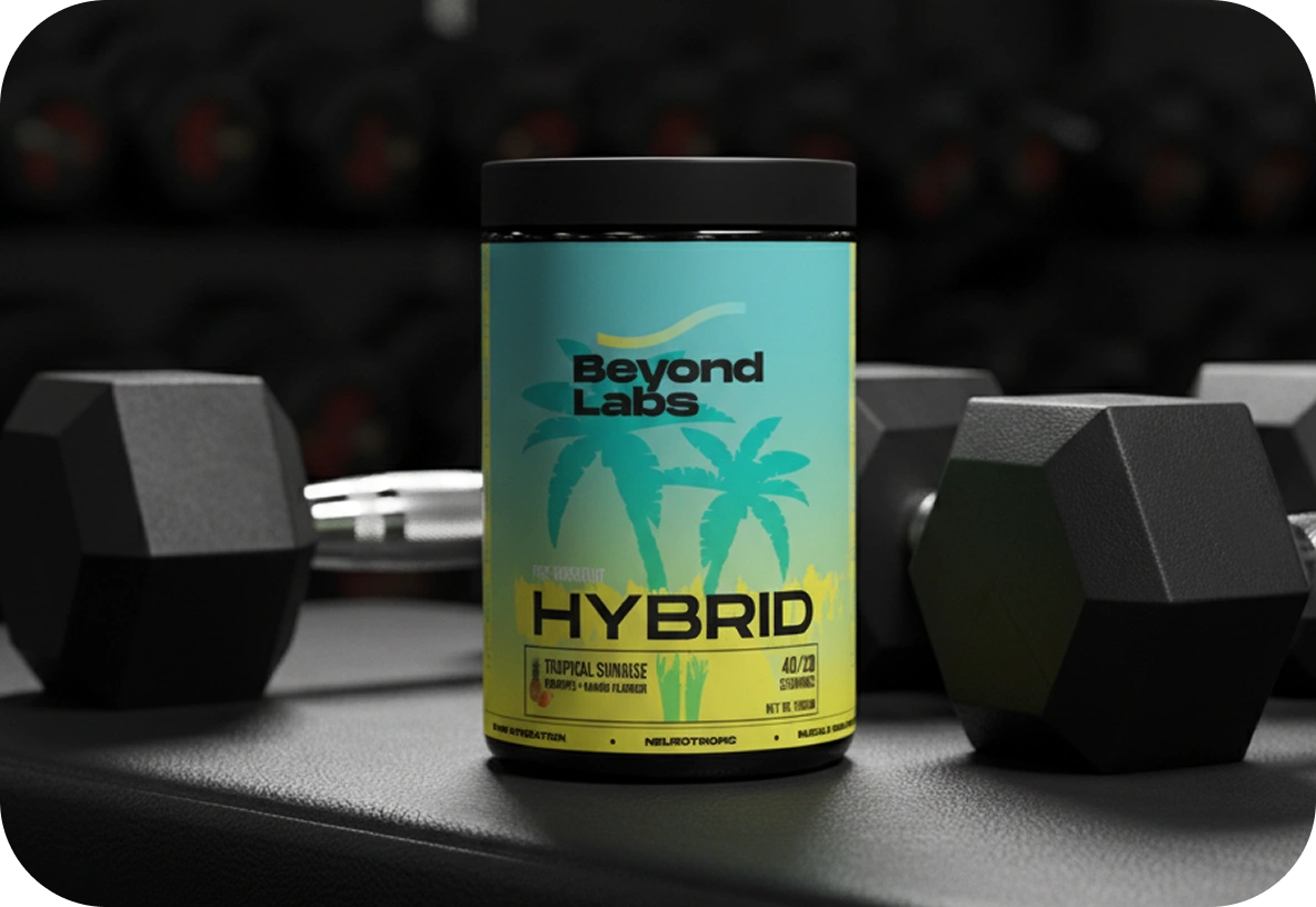
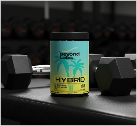
 Beyond Labs Hybrid
Product labels, jars and bottles
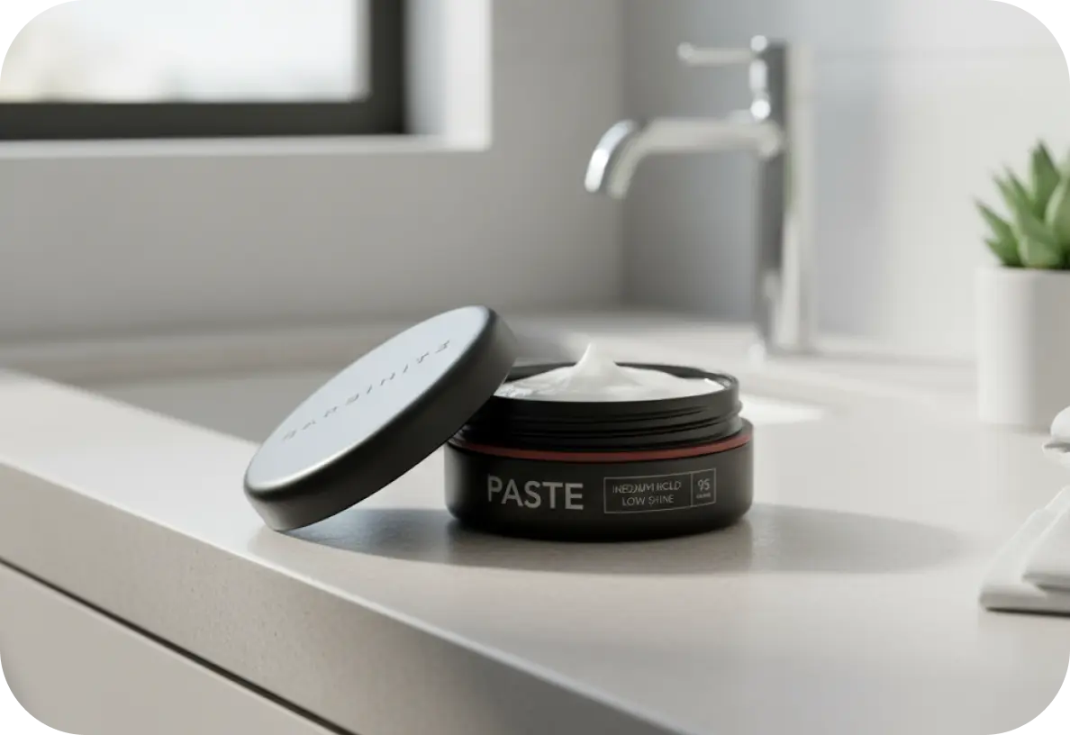
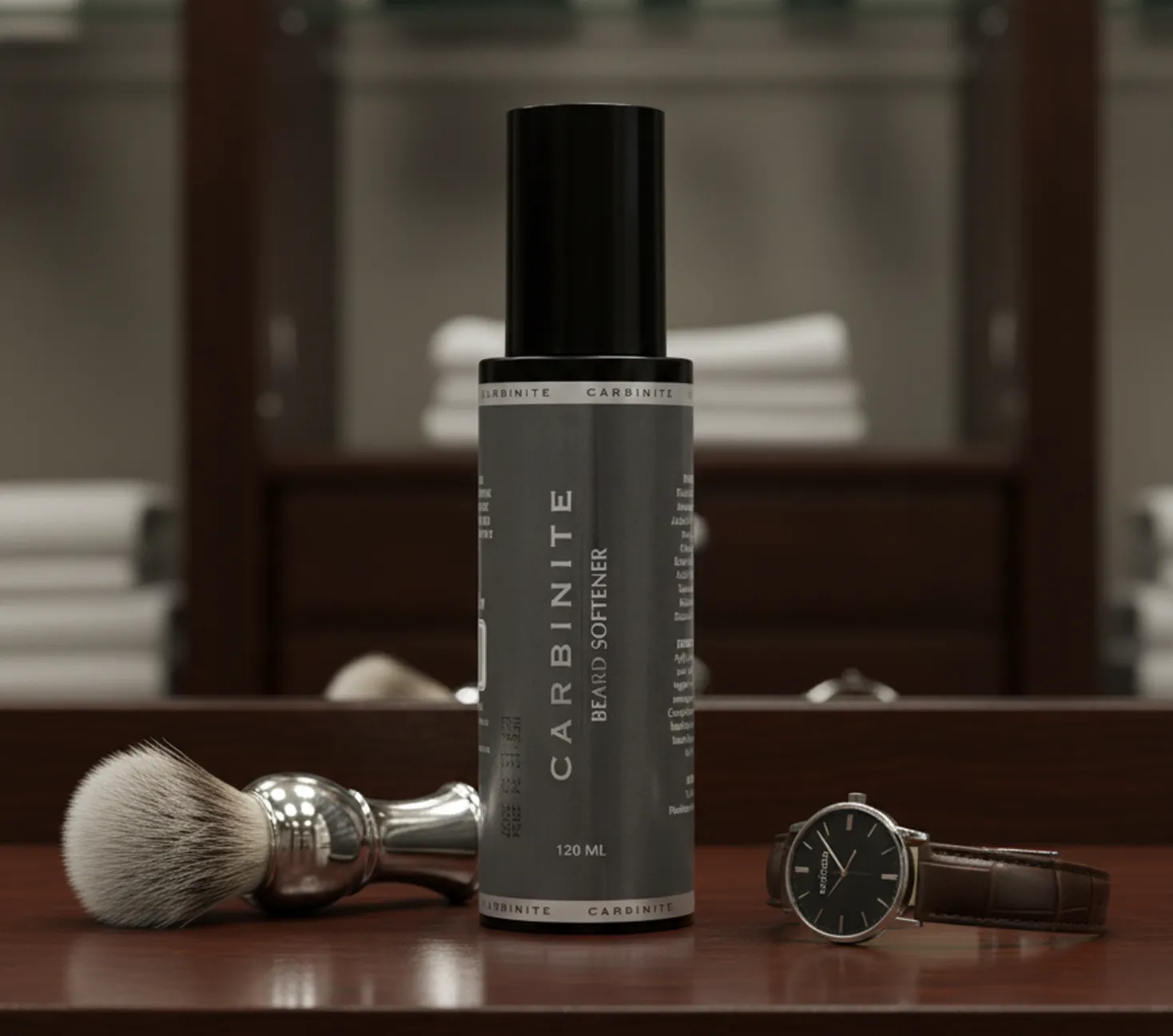
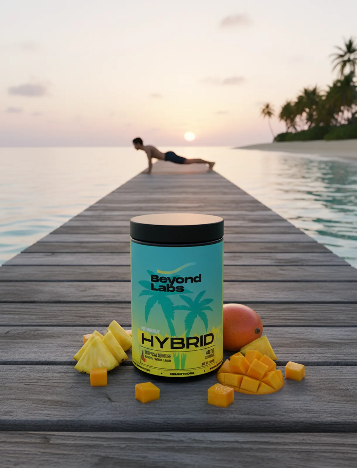
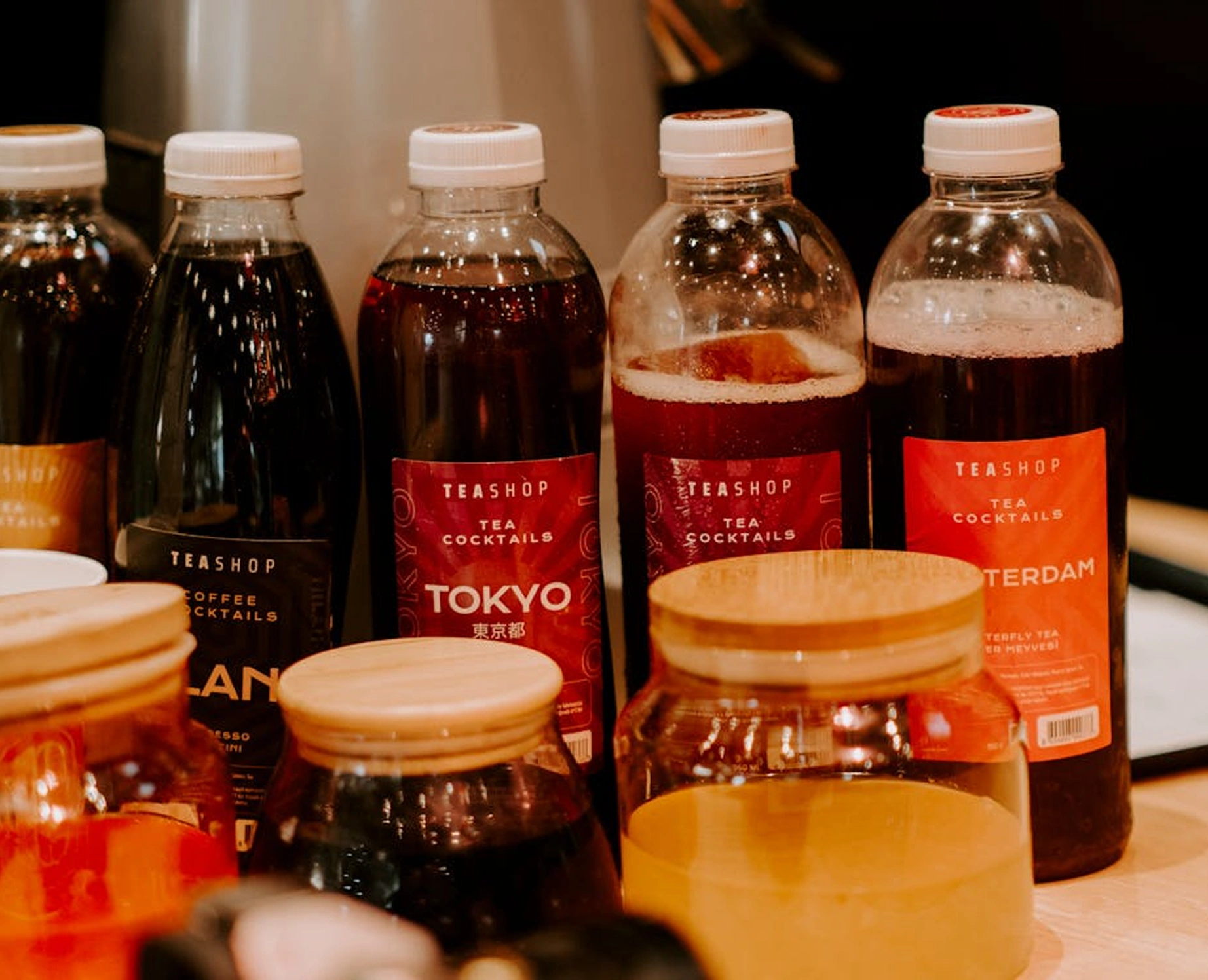
Curved surfaces, wraparound labels and small-format containers each change what’s possible. Our work spans a supplement label and packaging system for Beyond Labs Hybrid and a styling-paste jar label for a grooming brand — categories where dense information and a premium feel have to coexist.
Packaging label design as one system
When a product has both a printed pack and an applied label, they need to be designed together. Packaging label design means the pack and the label share one type scale, one colour spec and one information logic, so a customer sees a single brand rather than two design decisions made a month apart.
Variants, SKUs and ranges
Once the label architecture exists, new variants become a fill-in-the-blanks exercise instead of a fresh design job. That’s where the subscription model pays for itself — a flavour extension or a new size is a 24-hour turnaround, not a new project brief.
Print design that matches the brand it came from.
Print is where brand consistency usually breaks. The website is governed by a design system, and then a trade-show banner gets made by whoever had InDesign open. Our print design work treats every printed asset as part of the same identity — the same type scale, the same palette, the same spacing logic as everything else the brand produces.
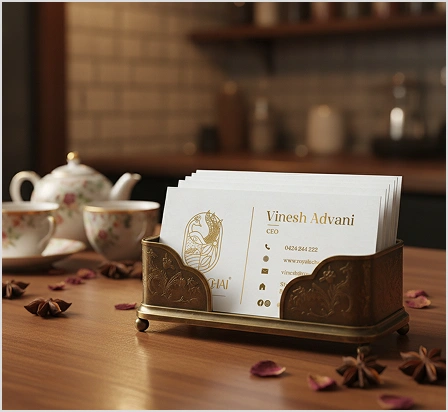
 Royale Chai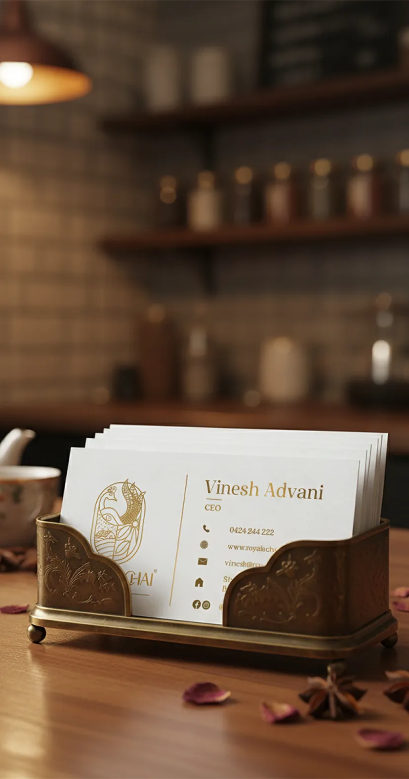
Business cards and stationery
Small format, high scrutiny. Cards, letterheads and stationery are held at reading distance and judged on stock, weight and how cleanly the type is set. These are also the assets people notice when they’re wrong.
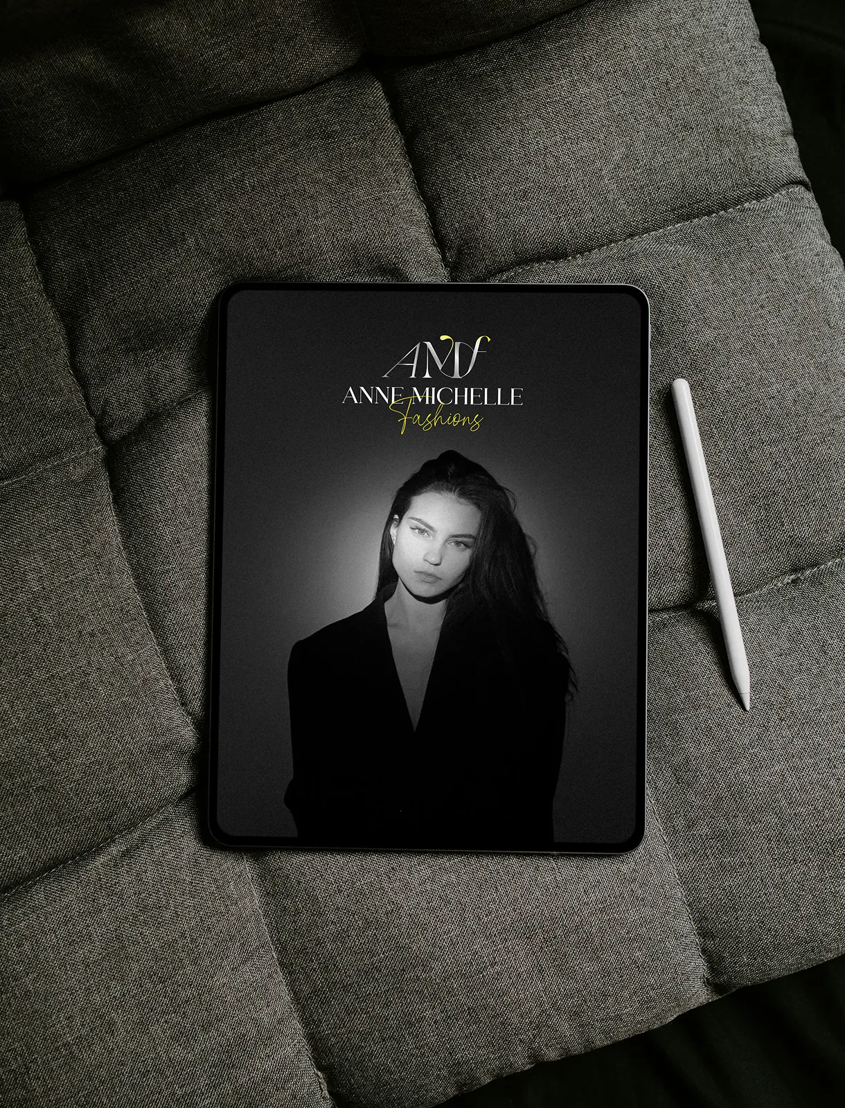
Brochures, flyers and editorial design
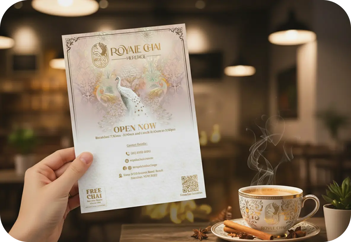
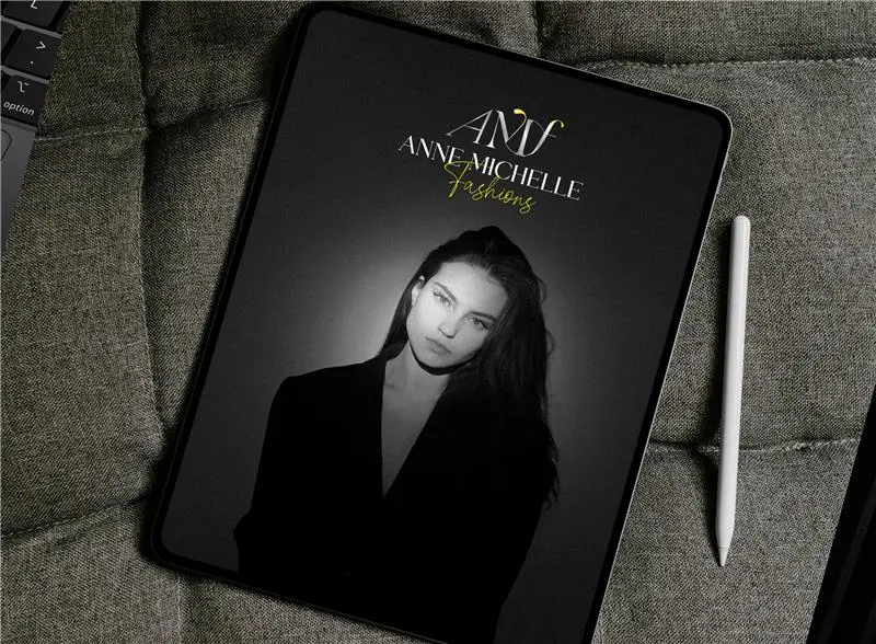
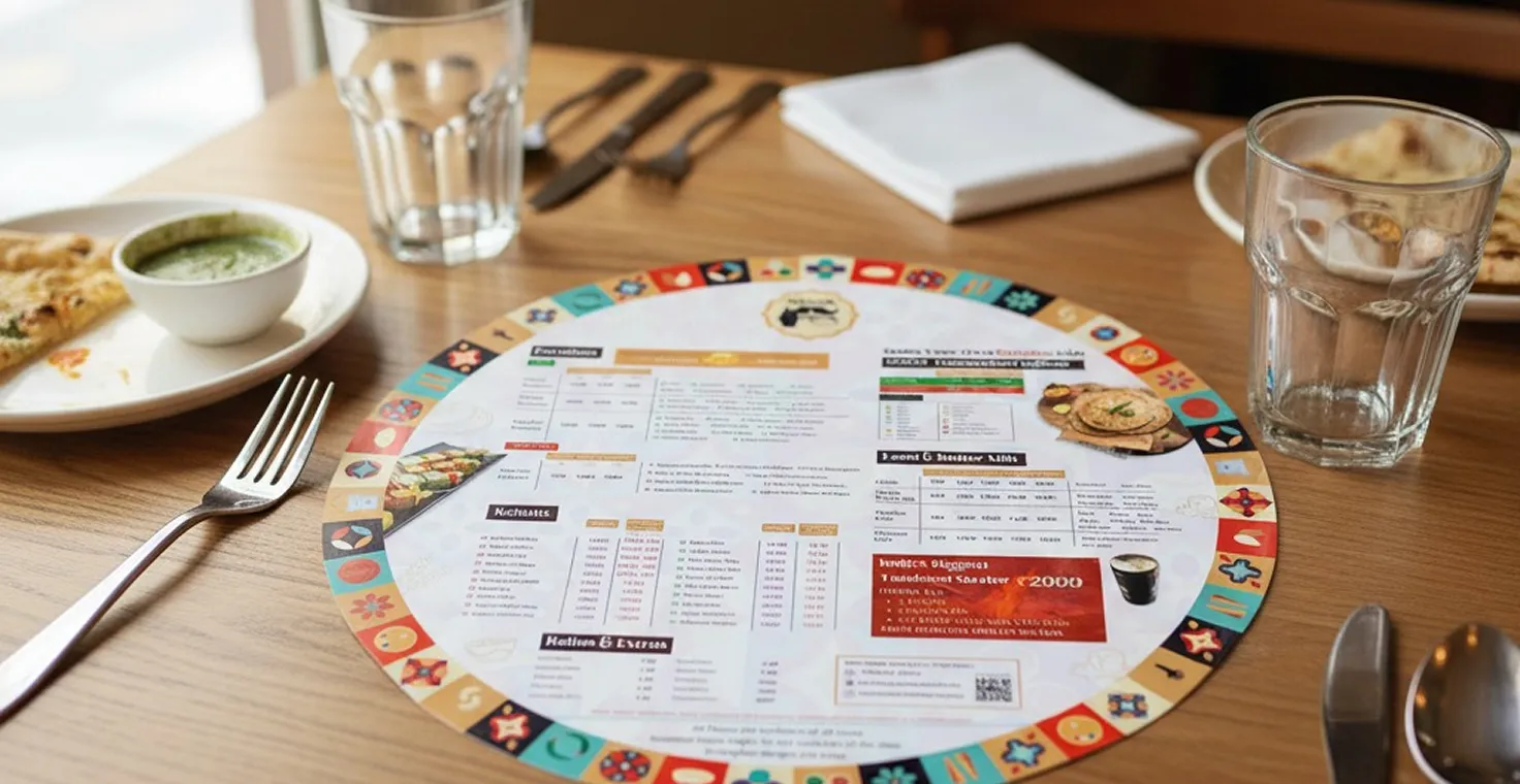
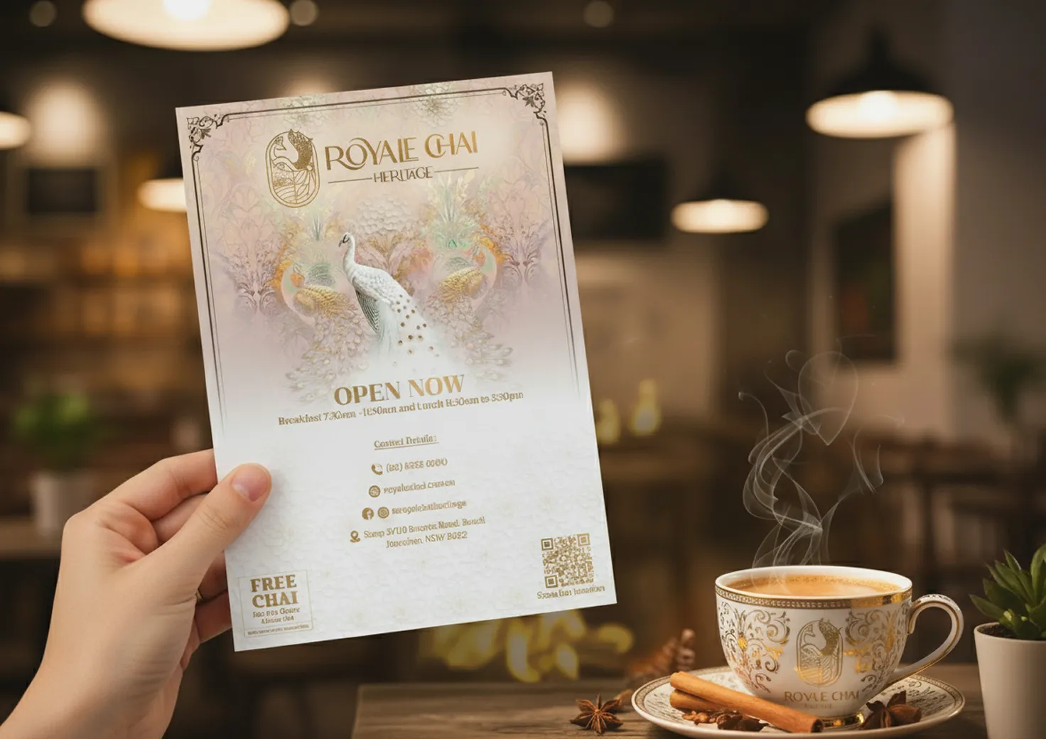
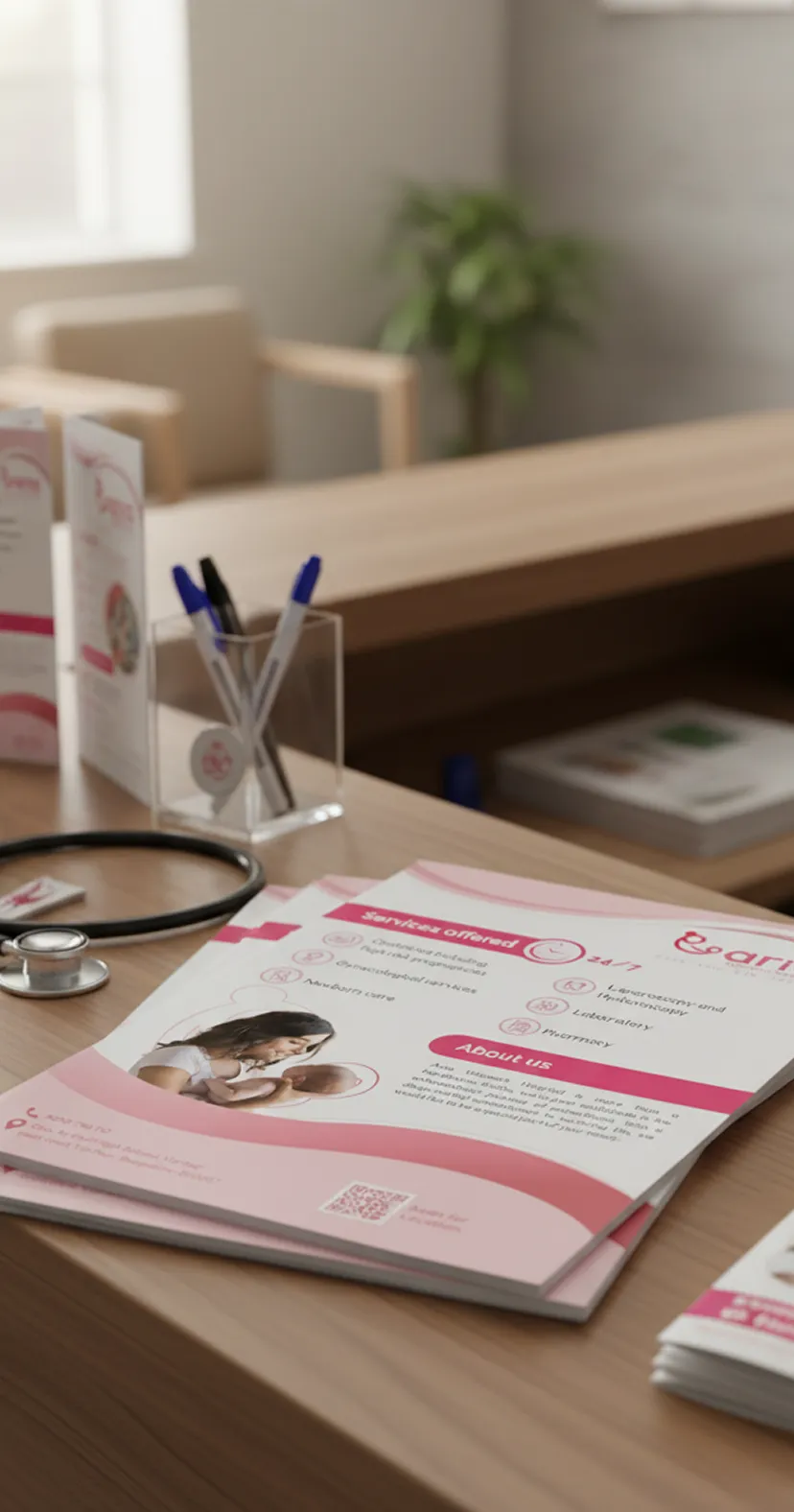
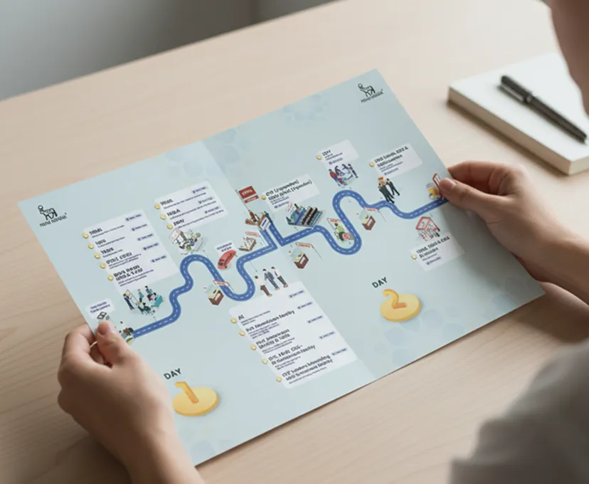
Multi-page print is editorial design: grid, pacing, where the reader’s eye rests, how a spread introduces and then supports an argument. Lookbooks, product brochures, sales collateral and launch flyers — the Royale Chai launch flyer sits alongside its branded teacup as one piece of the same rollout. Our Anne Michelle Fashions work applies the same editorial layout thinking to a fashion brand.
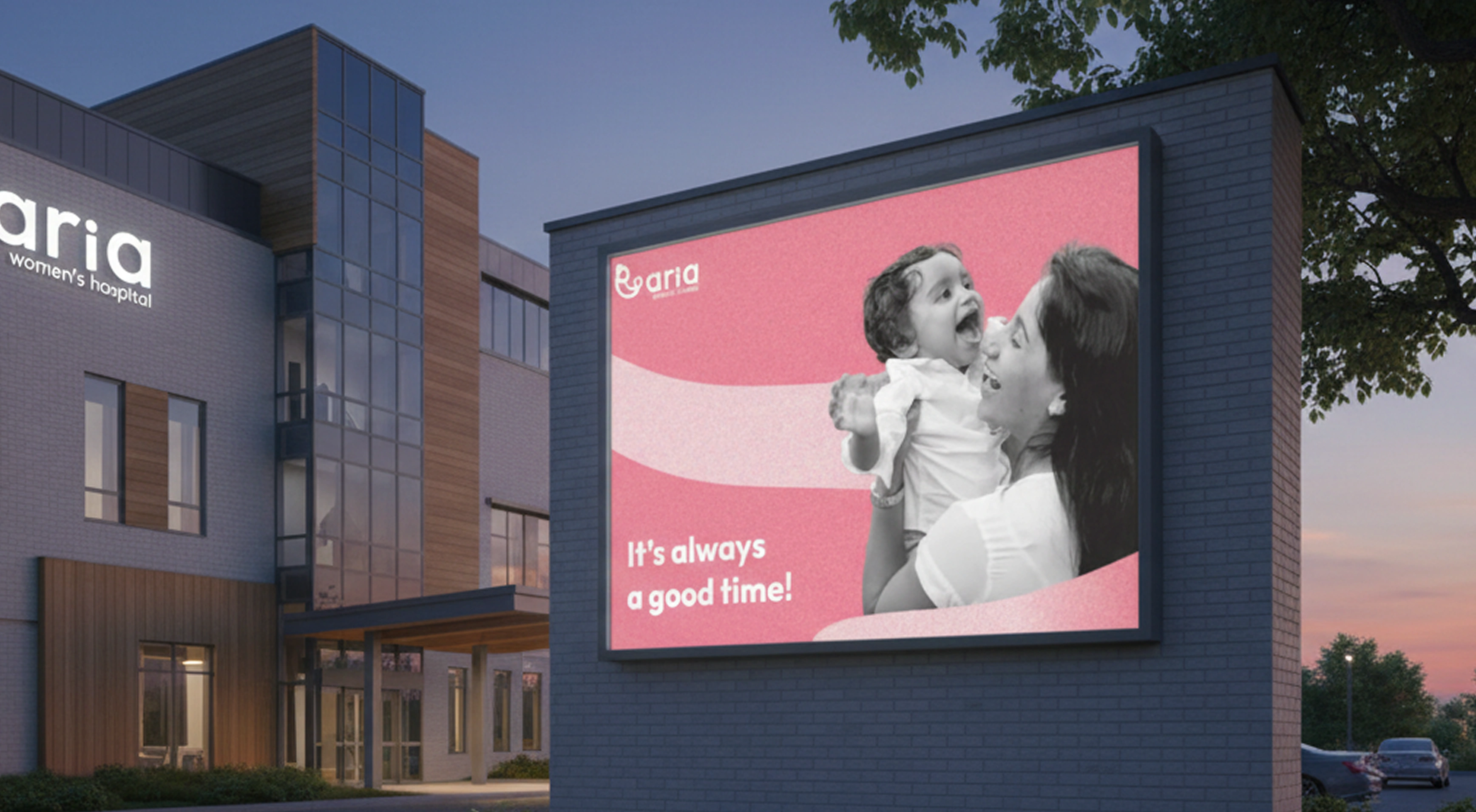
Posters, banners and large format
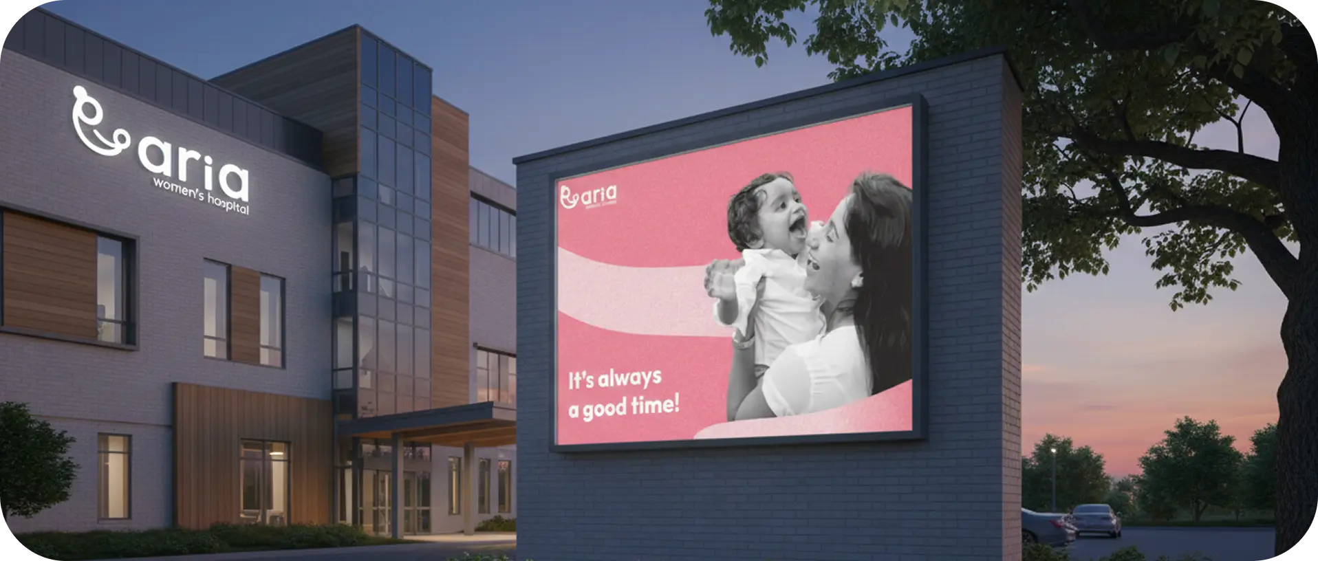
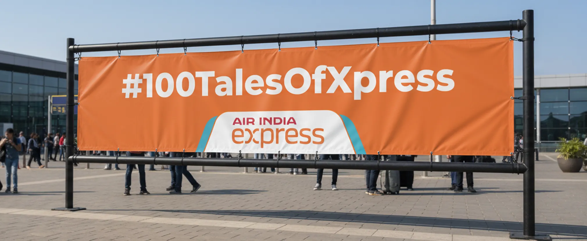
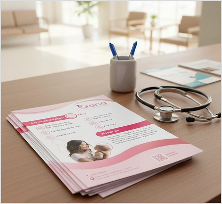
Large-format print is a legibility discipline. Type that works at A4 fails at three metres. We design for the viewing distance and the environment — retail, event, or exterior, as with the outdoor campaign and signage work for Aria Women’s Hospital.
What’s Included
Packaging Design
Eye-catching boxes, labels, and containers.
Label Design
Clear, compliant product labels that pop.
Business Cards
Professional cards that make connections.
Brochures & Flyers
Engaging print materials that inform.
Posters & Banners
Large-format designs that demand attention.
Dieline Development
Technical templates for production.
The file your printer runs without sending it back.
This is the part of packaging design that decides whether a launch date holds. Beautiful artwork that arrives in RGB, with no bleed, live fonts and a dieline that’s been nudged is a week of delay and a reprint bill.
Every packaging and print deliverable leaves us as production-ready artwork:
- 01
Dieline development — technical templates built for production, with cut and crease geometry on its own named layer, kept locked and unscaled
- 02
Correct colour — CMYK for process work, Pantone specified where brand colours must match across SKUs and substrates
- 03
Bleed, safe zones and crop marks set to the specification your printer works to
- 04
Outlined type and embedded images, so nothing shifts on a machine that doesn’t have your fonts
- 05
Finish layers separated — foil, spot varnish, emboss and white ink each on their own layer where the substrate needs it
- 06
Vector source files you own and can reuse
We work directly to your converter’s dieline when you have one, and develop it when you don’t. We coordinate with your manufacturer or printer on specifications so the handoff is a file transfer, not a negotiation.
What this does for the business.
Recognition that compounds
A pack designed as part of an identity system builds recall every time it’s seen. A pack designed in isolation resets that work with every SKU.
Clearer product communication
Most packaging failures are information-architecture failures — the customer can’t tell quickly enough what the product is or who it’s for. Fixing the hierarchy is usually a bigger lever than changing the aesthetics.
Consistency across every physical touchpoint
Pack, label, brochure, card and banner produced by one team, from one system, stop the slow drift that makes a brand look smaller than it is.
Fewer production surprises
Correct files mean fewer prepress corrections, fewer reprints and launch dates that survive contact with the press.
Cost that stays predictable
A flat monthly rate covers a packaging system, a label variant and next month’s collateral. No per-asset quoting, no scope negotiation for a new SKU.
How it works.
Four steps, one system, no busy work. We handle strategy, design and production files end to end — you brief, review, and go to press.
1. Understand & Strategize
We learn about your product, audience and shelf presence — the category you’re competing in, the formats you sell in, and the printer or converter you’ll be working with.
2. Concept & Explore
We develop multiple design directions and packaging concepts, applied to the real format rather than shown as flat artwork.
3. Refine & Perfect
We polish the chosen direction with your feedback, resolving hierarchy, colour and type at production scale.
4. Prepare & Deliver
We create production-ready files for printing — dielines, colour profiles, bleed and separated finish layers, built to your printer’s specification.
Where this fits best.
New product launches
A first pack, a label and the launch collateral around it, produced together so the brand lands as one thing.
Growing product lines
A packaging architecture that absorbs new variants, sizes and formats without a redesign each time.
Rebrands reaching the shelf
A new identity is only real once it’s on the physical product. We take an existing brand system and resolve it across every pack, label and printed asset.
Marketplace and retail in parallel
Packaging that has to work at arm’s length on a shelf and as a thumbnail in a listing — two very different legibility problems on one artwork.
Brand and marketing teams without in-house print capability
Teams with strong digital design and no one who can prepare a folding-carton file. We slot in as that capability.
Packaging that stops the scroll and wins at retail.
Print design that feels premium in hand and builds brand trust.

Why teams choose DesignHQ as their packaging design partner.
- 01
Packaging designers and print designers, not generalists
Print has rules that don’t exist on screen. You get people who have set a jar label, built a folding-carton dieline and prepared large-format artwork — and who know what a converter will reject.
- 02
Design that begins with identity
We came to packaging through brand work. That’s why our packaging design services start with the system and not the template, and why a pack we design still looks like the brand two SKUs later.
- 03
One subscription across every discipline
Packaging and print sit alongside brand and marketing design, product and digital design, motion and video and presentations — the same team, the same design language, one monthly rate.
- 04
Speed that suits real launch calendars
24-hour turnaround on individual assets. A new variant label doesn’t wait for a project window.
- 05
Fixed, transparent pricing
Plans from $1,500/month. No hourly billing, no per-asset quotes, no scope renegotiation when a SKU gets added. See pricing.
- 06
Designing from India, creating for the world
Our studio is at JBR Tech Park, Whitefield, Bangalore, working with brands across India and internationally. Part of Prismscale.
Ideas That Shape Better Design
Explore insights on creativity, technology, and the future of design.
Packaging & print design FAQs.
We design the graphics and develop the dieline — the technical template that tells a printer where to cut and crease. We don’t engineer new structural formats or manufacture packaging. In practice, most projects use a standard format from your converter, and we build the artwork onto it. If you’re still choosing a format, we’ll work through the options with you before design starts.
Yes, and we prefer it. Send us the dieline your converter supplied and we’ll build artwork onto it with the cut and crease geometry locked on its own layer, so nothing shifts. If you don’t have one yet, we’ll develop it and prepare it for your printer to check against their die.
Vector source files plus a press-ready PDF, set in CMYK or with Pantone colours specified, with bleed, safe zones and crop marks to your printer’s spec, all type outlined and images embedded. Finishes like foil, spot varnish and white ink come on separate named layers. The files are yours to keep and reuse.
We design the layout for it — legible type sizes, correct reading order, and barcode placement on a scannable flat area. You supply the required content, and any legal or regulatory review stays with you or your compliance advisor. We’re designers, not a regulatory consultancy, and label requirements differ by market and category.
Individual assets turn around in 24 hours. A complete packaging system is a sequence of those — direction, refinement, then production files — so a first pack typically runs over a few rounds rather than a single day. Once the architecture exists, additional variants and SKUs move at single-asset speed.
It’s a subscription rather than a per-project fee. Plans start at $1,500/month and cover packaging, labels and print collateral alongside every other design discipline we offer. For teams shipping several SKUs a year, that usually works out below per-project agency rates — and it’s a fixed number you can plan against. Full pricing.

Let's Connect.

Let's Connect.
Let's Connect.
Let's Connect.