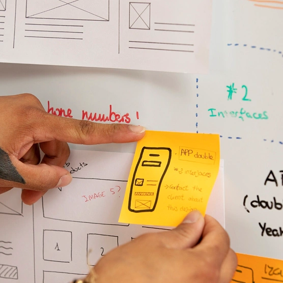
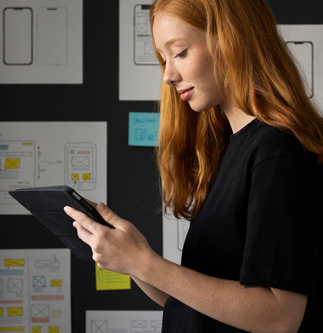
Mastering Mobile Interactions
Mobile interaction design is different from desktop—not just smaller screens, but fundamentally different input methods and user contexts. Thumbs vs cursors. One hand vs two. Glancing while walking vs focused attention at a desk.
The thumb zone matters. The bottom third of the screen is easy to reach with one hand; the top corners require stretching or repositioning. Place your most frequent actions in the comfortable reach zone. This single principle improves usability dramatically.
Gestures need to feel natural and discoverable. Swipe to delete is now standard because it mimics the physical action of pushing something away. But complex gesture sequences that require tutorial videos? Those are friction points that lose users.
Mobile-first design forces prioritization. You can't fit everything, so you have to choose what matters most. This constraint actually improves desktop experiences too—it forces you to question whether every element truly needs to be there.
Ideas That Shape Better Design
Explore insights on creativity, technology, and the future of design.


Let's Connect.

Let's Connect.
Let's Connect.
Let's Connect.