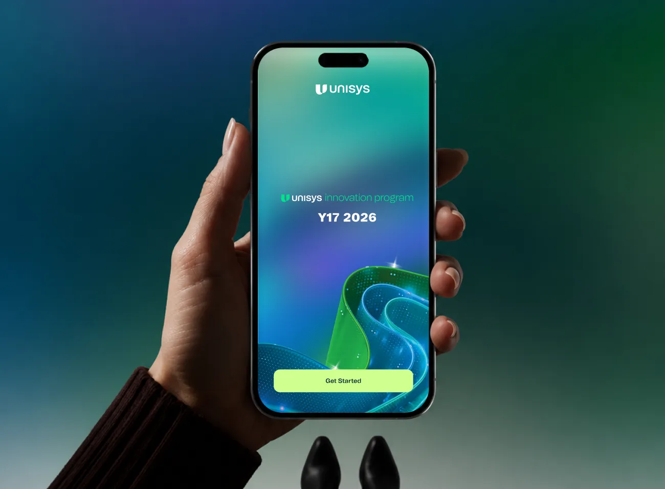
Product Design · Event App
Unisys
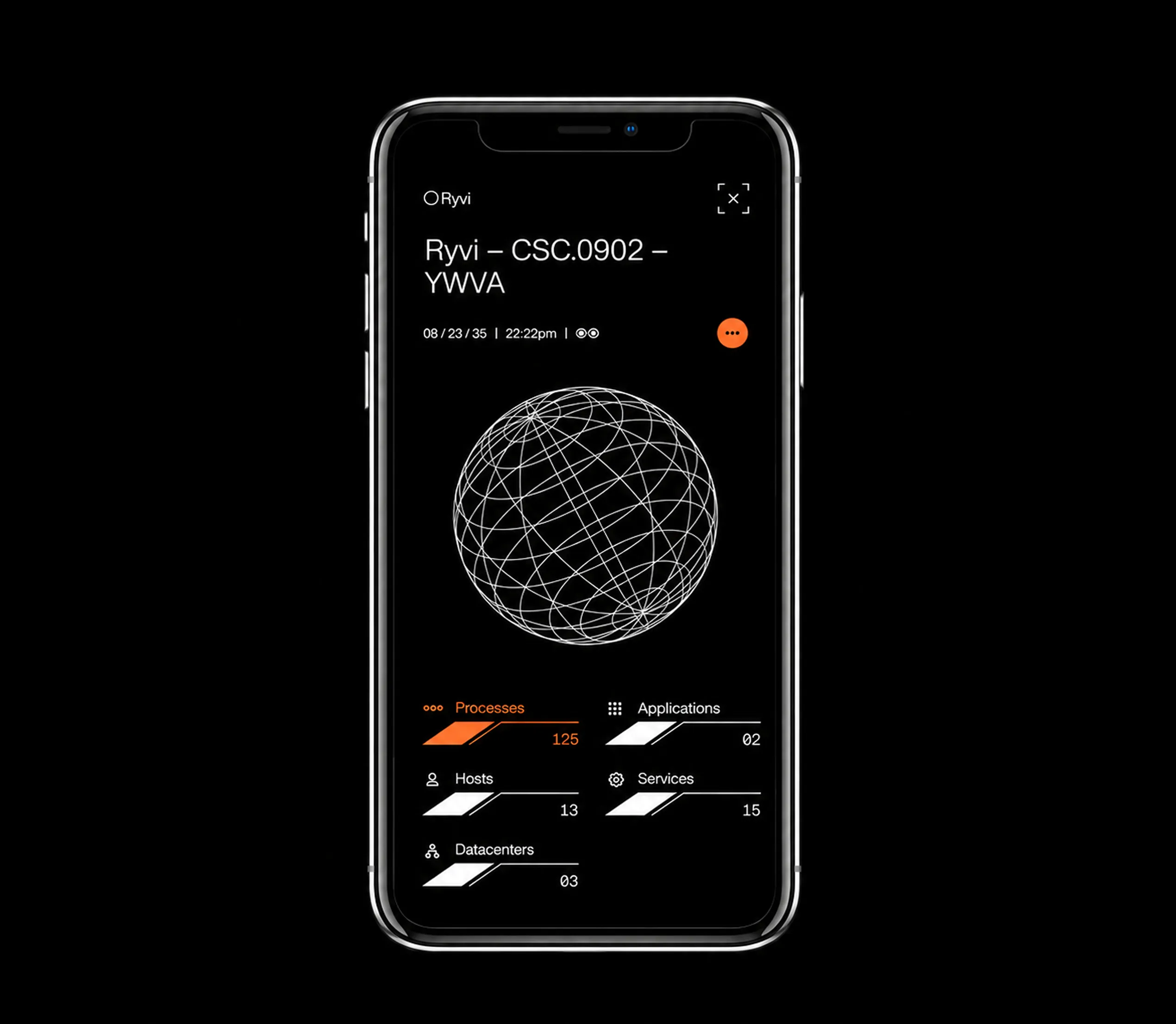
No paper. No queues. No lost agenda. Attendees tap to check in, save the talks they want, vote in live polls, scroll the gallery, and let AR walk them to any room, from one place.
Mobile app design is the practice of designing interfaces that run natively or as web apps on iOS and Android devices. The constraint set is fundamentally different from web design — screen real estate is limited, input is touch-first, context switches happen constantly, and attention spans are shorter. Every tap, swipe, and scroll is a design decision.
Good mobile app design isn’t about shrinking a web interface to fit a phone.
It means understanding how people hold and use their devices in the real world, following the platform conventions that users have already learned, and making every flow achievable with the minimum possible friction.
We design mobile app interfaces for iOS and Android — separately where platform conventions diverge, from a shared design token foundation where they can be unified. The result is a consistent brand experience that still feels at home on each platform.
Platform-native, thumb-friendly, component-driven — every mobile surface your product needs, designed and delivered in Figma.

Interface design that follows Apple’s Human Interface Guidelines — tab bar navigation, SF symbol integration, Dynamic Type support, dark mode, and interaction patterns users expect from iOS. Delivered as a Figma file at iPhone 14/15 resolution.

Material Design 3 implementation with Android-native navigation conventions, FAB placement, bottom sheet patterns, and the component vocabulary that Android users already understand. Available in both light and dark system themes.

A shared design token foundation with platform-specific component divergence. One colour system, one type scale, one spacing grid — with iOS and Android component sets built on top. Designed for teams building in React Native or Flutter.

First-run experiences, permission request screens, and activation flows. Onboarding is where most apps lose users — we design onboarding sequences that demonstrate value quickly and minimise drop-off before the user reaches the core product.

High-polish B2C mobile interfaces where design quality is a direct competitive differentiator — lifestyle apps, fintech products, health and wellness tools, marketplace apps. Emotional resonance matters here as much as functional clarity.

Field service apps, mobile dashboards, inspection tools, and enterprise productivity apps. Often used in demanding environments — outdoors, one-handed, under time pressure. We design for real-world use, not just demo conditions.

A complete Figma design system for mobile — colour tokens, type scale (with device scaling rules), spacing grid, component primitives, and a defined iconography approach. The foundation every screen is built on.

Pixel-precise screens for every agreed flow — including empty states, loading states, error states, and edge cases. Designed at standard device resolutions for both platforms as required, with dark mode variants on request.

Separate Figma component sets for iOS and Android, built on a shared token foundation. Each component includes all required states and variants. Auto-layout throughout for accurate responsive behaviour.

A Figma prototype covering the primary user flows — linked screens, simulated transitions, and gesture hints. Used for stakeholder sign-off, user testing, and developer orientation before implementation begins.

Token exports in JSON format, compatible with Tokens Studio and Style Dictionary. Every colour, spacing unit, radius, and shadow as a named variable — ready for direct implementation in React Native or Flutter theme files.

An annotated Figma handoff file with spacing specs, gesture documentation, transition notes, and platform-specific implementation guidance. Optional live walkthrough call with your mobile development team.
Five stages. Every engagement. Each one has a defined output that closes before the next opens.
We review your product concept or existing app, define the platform scope (iOS, Android, or both), agree on user flows, and set deliverable expectations. New projects get a user flow map before design begins.
Colour system, type scale, spacing grid, component primitives. We build the mobile design system first — this is where your app’s visual identity is established and the token architecture is set up for development.
High-fidelity designs for the primary user flows — onboarding, core task, key settings, navigation. Reviewed and iterated with your team. Platform conventions applied precisely. Interactive prototype built for testing.
Secondary flows, edge cases, empty states, error states, notifications, and permission screens. Every screen built from the component system — consistency by construction, not manual effort.
Final Figma files, token exports, interaction documentation. Optional live handoff call with your iOS and Android developers. On subscription engagements, handoff is a milestone — the design cycle continues with the next feature sprint.
A selection of recent product and digital work, each one linking through to the full case study.
Product Design · Event App
No paper. No queues. No lost agenda. Attendees tap to check in, save the talks they want, vote in live polls, scroll the gallery, and let AR walk them to any room, from one place.
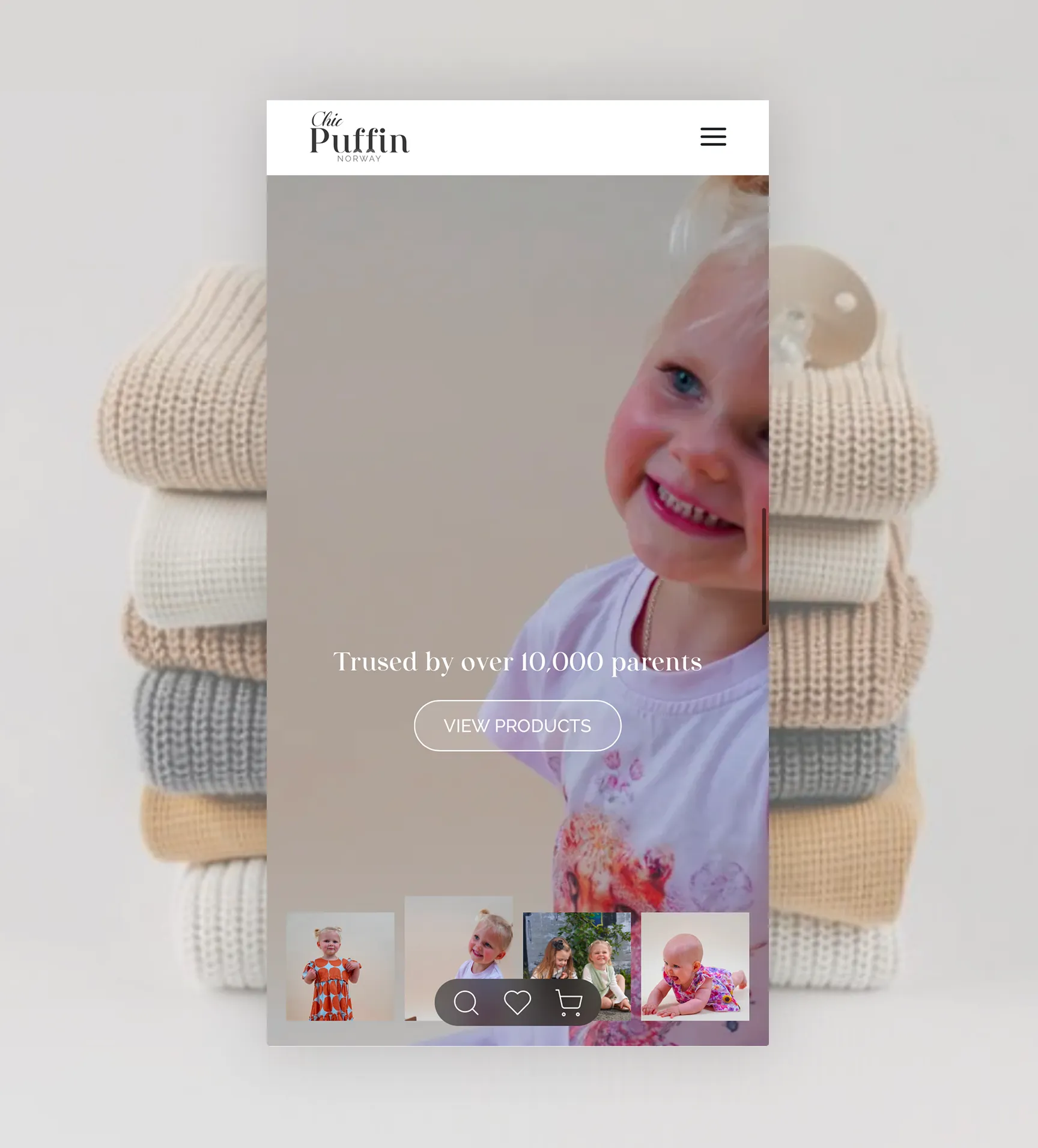
Branding · Web Design
ChicPuffin needed to feel imaginative enough for children, yet considered enough for a premium fashion label. We built a soft, cohesive identity where playful details meet understated elegance.
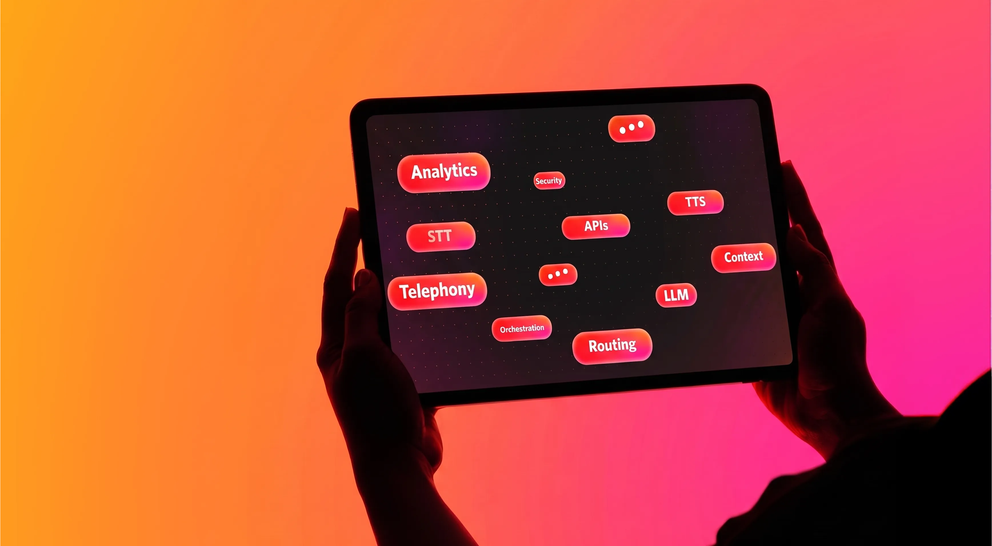
Motion Graphics · Fashion
A launch-ready suite of presentation motion graphics and event standees for one of India’s largest fashion commerce platforms.
We work with product teams where mobile is a primary surface, not a checkbox.

You have a concept and a developer but no designer. We build the full mobile UI from scratch — UI system, onboarding flow, core screens — delivered as a Figma file ready for development from day one.

Your web product is established and you’re extending to mobile. We design the mobile app using the same design language as your web product — consistent brand, platform-native UX, shared token foundation.

Your app works but the interface is holding back ratings, retention, or growth. We audit the existing product, identify the highest-friction flows, and redesign incrementally — not a full rebuild from scratch.

B2C apps where design quality is directly tied to adoption and retention. Fintech, health, lifestyle, marketplace — categories where a poor interface means your users leave for a competitor before the end of their first session.

Cross-platform codebases with a token-ready design system requirement. We deliver a Figma component library with Tokens Studio integration, a JSON token export, and platform-specific component variants your engineers can implement directly.

B2B apps used by field workers, healthcare staff, retail associates, or logistics teams. We design for the actual usage environment — not a conference room demo — with accessibility, offline states, and operational clarity as first-class concerns.
We know where generic mobile design agencies cut corners. Here is what we do instead.

We follow iOS Human Interface Guidelines and Material Design 3 because users have learned these patterns. Violating them creates friction that users feel before they can articulate it. We know where to follow convention and where to thoughtfully diverge.

Every tap target, swipe gesture, and scroll behaviour is designed for thumbs on glass — not a mouse cursor. We apply minimum touch target sizes, test thumb-zone ergonomics on real device dimensions, and think about one-handed use from the start.
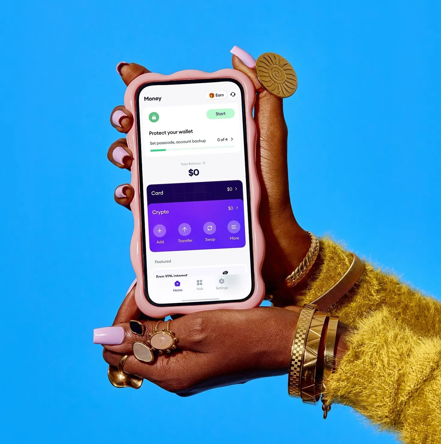
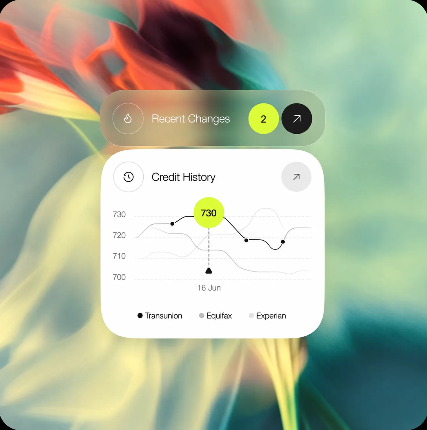

When you need iOS and Android, we don’t design them twice from scratch. We build a shared token foundation — colour, spacing, type — and diverge only where platform conventions require it. One source of truth, two platform implementations.

Empty states, offline states, loading states, error states, and permission request screens are not afterthoughts — they are part of every engagement. Your development team will not hit unexplained design gaps when they reach those states.

Every mobile engagement includes an interactive Figma prototype of the core flows. Stakeholders can walk through the product, users can be tested on it, and developers can understand transitions and gestures before writing a line of code.
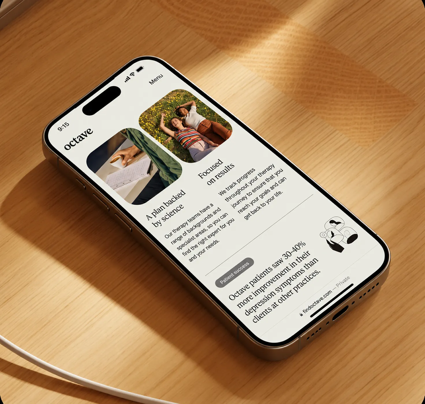

Mobile app releases don’t stop. On subscription, our design queue runs in parallel with your sprint cycle. New features get designed before the sprint, not after it starts. No per-screen billing, no proposal delays.


Component-driven interface design for the visual execution layer. The same principles that make a great mobile interface — component systems, tokens, handoff — applied to web and marketing surfaces.
Component-driven interface design for the visual execution layer. The same principles that make a great mobile interface — component systems, tokens, handoff — applied to web and marketing surfaces.
Component-driven interface design for the visual execution layer. The same principles that make a great mobile interface — component systems, tokens, handoff — applied to web and marketing surfaces.
Component-driven interface design for the visual execution layer. The same principles that make a great mobile interface — component systems, tokens, handoff — applied to web and marketing surfaces.
Component-driven interface design for the visual execution layer. The same principles that make a great mobile interface — component systems, tokens, handoff — applied to web and marketing surfaces.
A mobile app design engagement includes a UI system (colours, type, spacing, components), high-fidelity screens for every agreed flow, platform-specific variants for iOS and Android where required, interactive prototypes for user testing, design tokens, and a Figma developer handoff file. Scope is agreed at kickoff.
Yes. We design for both platforms and we understand the differences — navigation patterns, component conventions, gesture semantics, and OS-level UI language differ between iOS (HIG) and Android (Material Design 3). Where a shared design token system allows it, we build one foundation and diverge only where the platform conventions require it.
Yes. All deliverables are Figma-native. We deliver a component library with platform-specific variants, auto-layout screens at standard device resolutions, a design token file, and annotated handoff screens. We can also deliver interactive prototypes for usability testing or stakeholder demos.
Yes. App redesigns are a significant part of our mobile work. We start with an interface audit — identifying the flows with the most friction, the components with the most inconsistency, and the platform conventions being violated. We then redesign incrementally: new UI system first, core flows second, full expansion third.
Mobile UX design covers research, flow mapping, information architecture, and wireframing — the structural decisions about what goes where and why. Mobile UI design is the visual execution layer — what it looks like, what the components are, how states behave. On most mobile projects, both are needed. We can handle either in isolation or both together depending on where you are in the process.
On a DesignHQ subscription, mobile app design works like any other service stream. You submit design requests aligned to your release cycle — new features, screen revisions, platform-specific variants — and we deliver within the agreed turnaround time. No statement of work, no per-screen billing. The subscription pauses when your roadmap pauses.
We design the UI — not the code. Our mobile design deliverables are framework-agnostic: a Figma component library, token exports, and annotated screens that your development team implements in whatever stack they use — React Native, Flutter, Swift, Kotlin, or a web wrapper. We work with your team’s constraints, not against them.