Branding · UI/UX
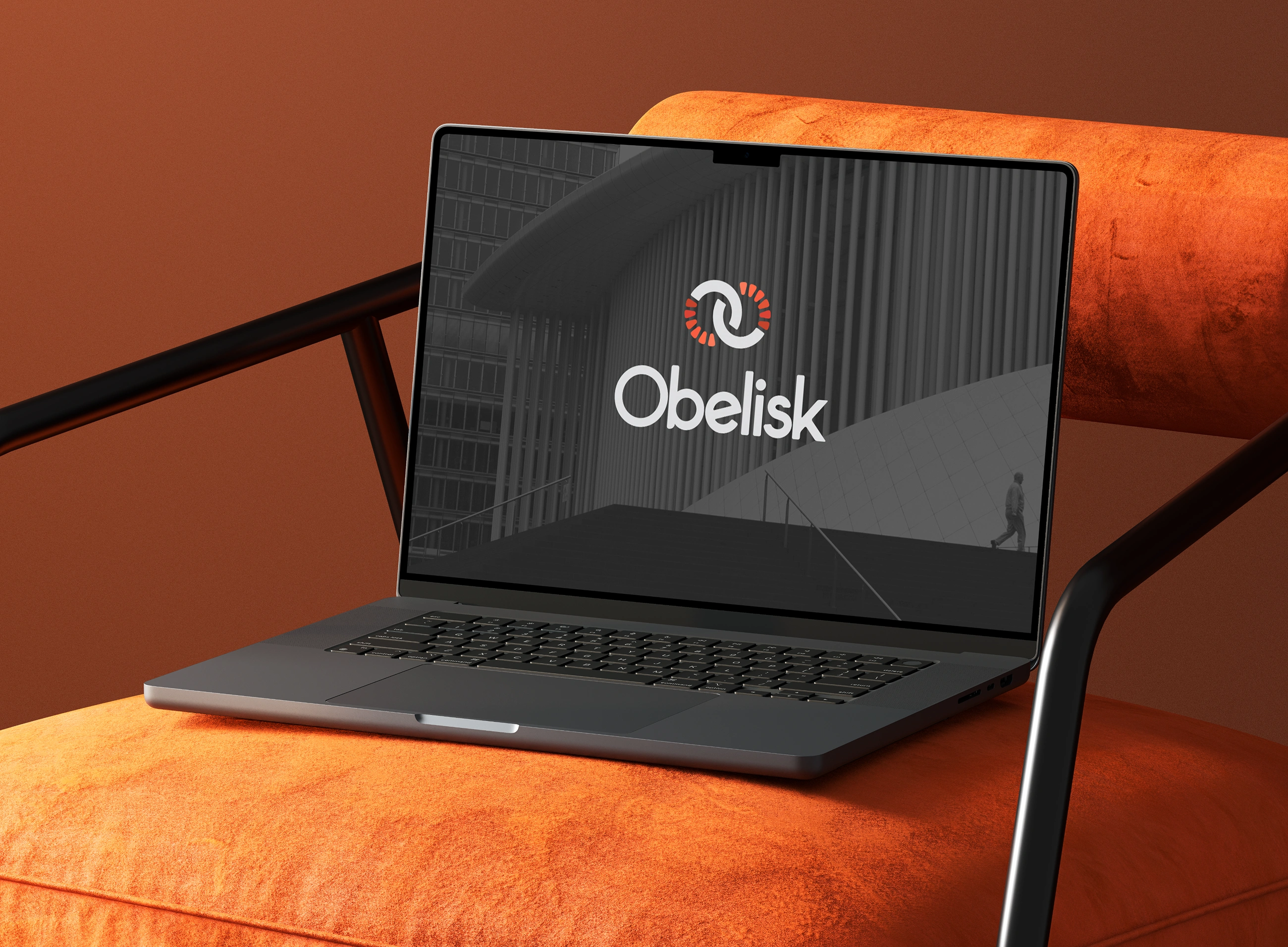
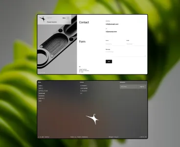
Obelisk
A strong, architectural brand and interface design for a BIM consultancy focused on precision, clarity, and modern workflows.
UI design is the visual execution layer of product design. Once the structure has been validated through wireframes, UI design determines what users actually see: the typography, colour system, component states, spacing, and the level of finish that separates a polished product from one that looks assembled rather than designed.
Good interface design does more than look considered. It communicates hierarchy through typographic decisions. It signals state changes — loading, error, success, disabled — clearly enough that users never have to guess. It establishes visual consistency through reusable components so that every screen in a product feels like it came from the same place.
What it is not: web design in the traditional sense, brand identity, or decorative art direction. Interface design services operate at the component level, building screens from a system of reusable parts that can be maintained and extended as a product grows.
Our UI design work is entirely Figma-native, delivered as structured component files, not static exports. Every screen includes all states. Every component includes spacing and behaviour annotations. The file your developers receive is the file they can build from.
Interface design for every surface your product ships on — SaaS products, web apps, mobile, marketing sites, and the component libraries behind them.

Dashboards, onboarding flows, account settings, data tables, and all core product screens for web-based SaaS applications.

Browser-based tools, internal platforms, and productivity apps. Data-heavy, function-first design that doesn’t sacrifice clarity for density.

Native mobile interface design for iOS and Android — platform conventions, gesture patterns, and component libraries adapted for touch-first navigation.

Marketing pages, product sites, and landing pages where the visual design carries the commercial message. Built for conversion, not just appearance.

Analytics screens, reporting tools, and data-dense interfaces that need hierarchy, legibility, and visual structure above everything else.

Reusable component sets for teams that need a consistent starting point for every new screen. Built in Figma with auto-layout and documented variants.

A Figma file containing every reusable component: buttons, inputs, form elements, cards, modals, navigation bars, tables, badges, and alerts. Each component includes all states and variant options.

Every screen in scope, designed to production quality. This includes all edge cases — empty states, error states, success states, and loading states — not just the happy path.

Spacing values, sizing rules, interaction behaviour, and edge-case notes for every component. Developers get what they need to build accurately without filing questions.

Desktop, tablet, and mobile versions of each screen. Layouts adapt — they are not simply scaled down. Breakpoint logic is documented in the Figma file.

A structured token set covering colour, typography, spacing, radius, and shadow. Named and organised for export to Tokens Studio or direct CSS custom property mapping.

A structured Figma file with named layers, organised pages, auto-layout throughout, and a clear separation between master components and screen compositions.
Five stages from brief to developer-ready Figma file. Each stage has a clear output before the next one starts.
Define the scope, platform, brand guidelines, existing constraints, and any wireframes or research assets that inform the design.
Two to three visual directions exploring typography, colour, and tone. Not full screens — enough to commit to a system before building one.
Establish the component library: buttons, inputs, cards, navigation, forms, tables — everything the screens are assembled from.
Apply the system to every screen in scope, including all states. Review rounds are built in — not bolt-on.
Deliver the structured Figma file with component documentation, developer annotations, and token export ready for engineering.
A sample of interface design engagements across B2B SaaS, enterprise, and product teams.
Branding · UI/UX
A strong, architectural brand and interface design for a BIM consultancy focused on precision, clarity, and modern workflows.
Product Design · Event App
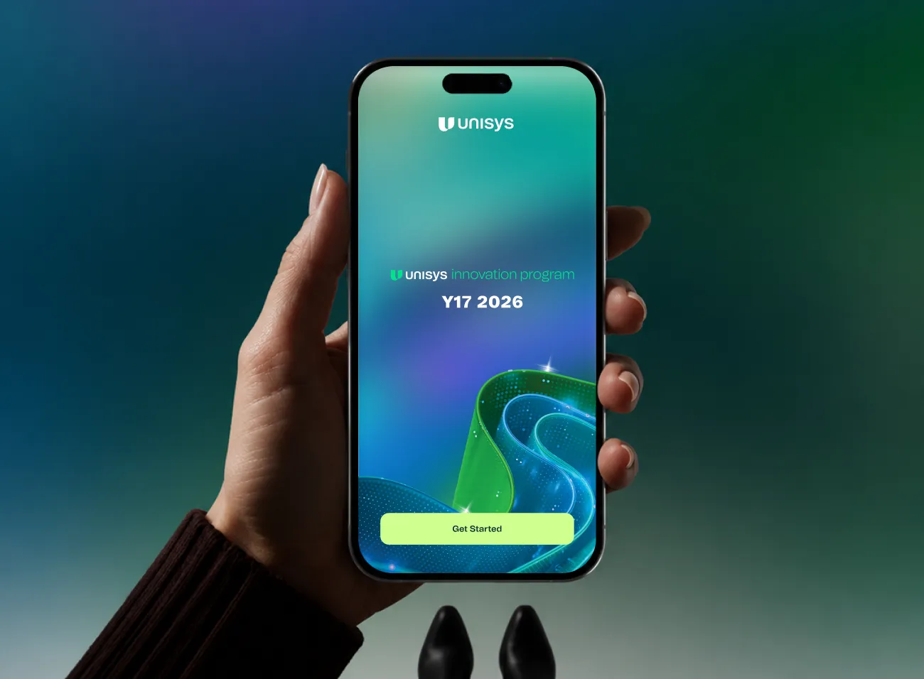
No paper. No queues. No lost agenda. Attendees tap to check in, save the talks they want, vote in live polls, scroll the gallery, and let AR walk them to any room, from one place.
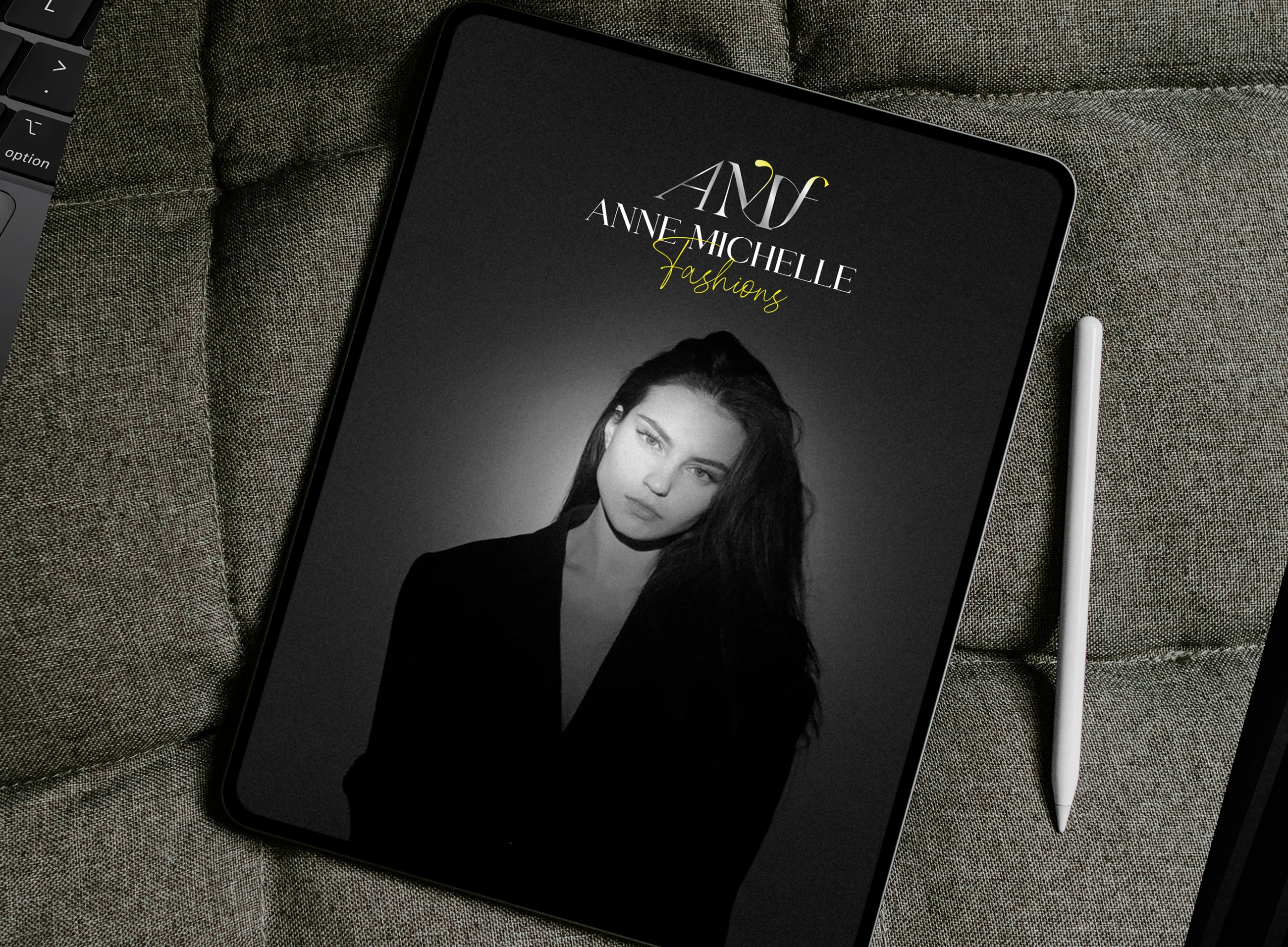
Branding · UI/UX
A premium, modern fashion identity paired with a refined digital experience that elevates the brand’s contemporary appeal.
A specific set of teams and circumstances where structured interface design services make a direct difference.

Wireframes are approved. Structure is signed off. You need a designer to turn the structure into a finished, consistent interface — without reinventing the layout decisions you already made.

No in-house design resource, but you need something that looks credible on launch day. A clean UI design from a proper component system reads differently to investors and users than a bootstrapped design.

The product has grown faster than the design system. New screens don’t match old ones. Buttons have five different border-radii. A structured UI redesign resolves inconsistency across the product in a single engagement.

You handle the strategy and development. The visual design layer is the gap. We step in as a dedicated interface design resource without the overhead of a full hire.

You’ve been handed design files before that weren’t structured for handoff. We deliver Figma files that engineering teams can actually build from — named layers, auto-layout, annotated components.

In-house designers are focused on strategy and product work. The visual design backlog is slipping. We run the UI design delivery so your team can stay focused on higher-leverage work.
Six things that matter when you’re choosing a UI design agency — not six lines of marketing copy.

We don’t design pages. We design a system of components and assemble screens from it. Every decision at the component level pays off every time that component appears.

Every deliverable is a structured Figma file — not a PDF export, not a Zeplin share, not a static image. Auto-layout throughout. Component instances, not flat shapes.



Colour, spacing, radius, and type are all token-driven. That means the system is maintainable, rebrandable, and exportable to code without a rebuild.

UI design works in cycles tied to your product roadmap. Each cycle has a clear scope and deliverable. You can scale up, pause, or redirect scope without a contract renegotiation.

We work on interfaces used by professionals — not consumer apps, not marketing campaigns. Data density, functional hierarchy, and professional credibility are our defaults.

We document edge cases — empty states, error states, loading states, edge-case content. Developers get what they need to build accurately. Fewer back-and-forths. Fewer build tickets.


User interviews, usability testing, UX audits, and research sprints. Evidence before decisions — so UI design is informed by what users actually need, not assumptions.
User interviews, usability testing, UX audits, and research sprints. Evidence before decisions — so UI design is informed by what users actually need, not assumptions.
User interviews, usability testing, UX audits, and research sprints. Evidence before decisions — so UI design is informed by what users actually need, not assumptions.
User interviews, usability testing, UX audits, and research sprints. Evidence before decisions — so UI design is informed by what users actually need, not assumptions.
User interviews, usability testing, UX audits, and research sprints. Evidence before decisions — so UI design is informed by what users actually need, not assumptions.
A UI design engagement includes a UI kit, high-fidelity screen designs, component annotations, responsive breakpoints, design tokens, and a developer-ready Figma handoff. Scope depends on the project — a new product starts with a visual style direction; an existing product may start with an audit and incremental uplift from there.
UX design covers structure, flow, and logic — how screens connect, where elements live, what happens when something goes wrong. UI design is the visual execution: typography, colour, spacing, component states, and the finish of every screen. Both are distinct disciplines that work best in sequence. We offer them separately and together.
Yes. Wireframes define structure; UI design defines how it looks and functions visually. Moving from approved wireframes to production screens is exactly what a UI design engagement covers. If you have signed-off wireframes, we can start from those directly — no need to redo the layout work.
All UI design work is done in Figma. Deliverables include a structured Figma file with pages, components, and auto-layout — set up for handoff to developers. We use design tokens compatible with Tokens Studio and CSS custom properties, and annotate components with the specs developers need to build accurately.
Yes. A redesign starts with an audit of the existing interface — identifying inconsistencies, outdated patterns, and visual friction — before moving into a new direction. The brief defines what’s in scope: a full redesign, a feature refresh, or a component-level consistency pass.
On a subscription, UI design runs in recurring design cycles. Each cycle has a defined scope — screens, components, or a feature flow — and delivers a structured Figma file at the end of the cycle. You direct scope based on your product roadmap. You can pause or scale the subscription as your workload changes.
Responsive UI design is standard — we design for desktop, tablet, and mobile breakpoints within the same engagement. If the project is mobile-first native (iOS or Android), that scope is handled through our Mobile App Design service, which accounts for platform-specific UI conventions and gesture patterns.